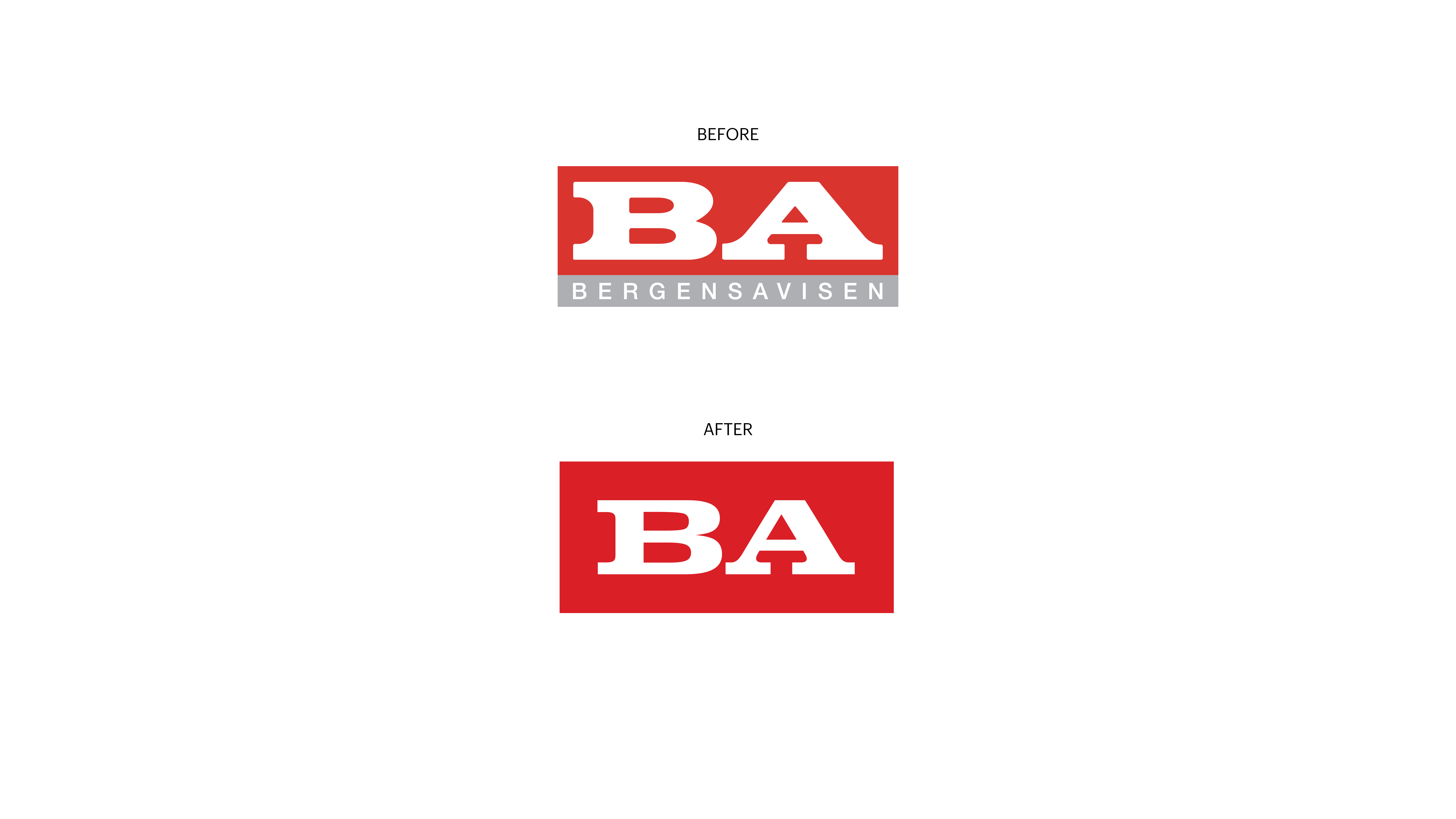

I’m glad to share the news, that I helped BA, Bergensavisen, Norway, with an update of their logo. BA is a part of Amedia, a Norwegian media group of 100 local medias.
Guro Valland, the Editor-in-chief and publisher at BA, Norway, contacted my studio, in January, to ask for help to update the logo.
— Anna’s work over the years has impressed me. She knows the touch and feel of the Scandinavian media brand landscape, and her portfolio shows a deep product knowledge. We are thrilled with how our updated logo turned out, say’s Guro Valland.
BA.no recently launched their new site design, part of the new digital design system, designed in-house by Amedia. The ambition is for BA to continue the good development the newspaper has had in recent years, by being an innovative and forward-looking newspaper that reflects the diversity in Bergen, Norway.
BA’s new logotype is an update of the previous logo (see before and after).

BA’s new logotype are designed to create a modern and distinct visual identity with strong impact. BA’s new visual identity is developed with a holistic coherent approach to function across all touch points.
BA’s abbreviation logo BA is based on a Clarendon typeface named Clarendon Extended. Clarendon is a typeface created in 1845 by Robert Besley and Benjamin Fox at the English foundry Fann Street Foundry, London.