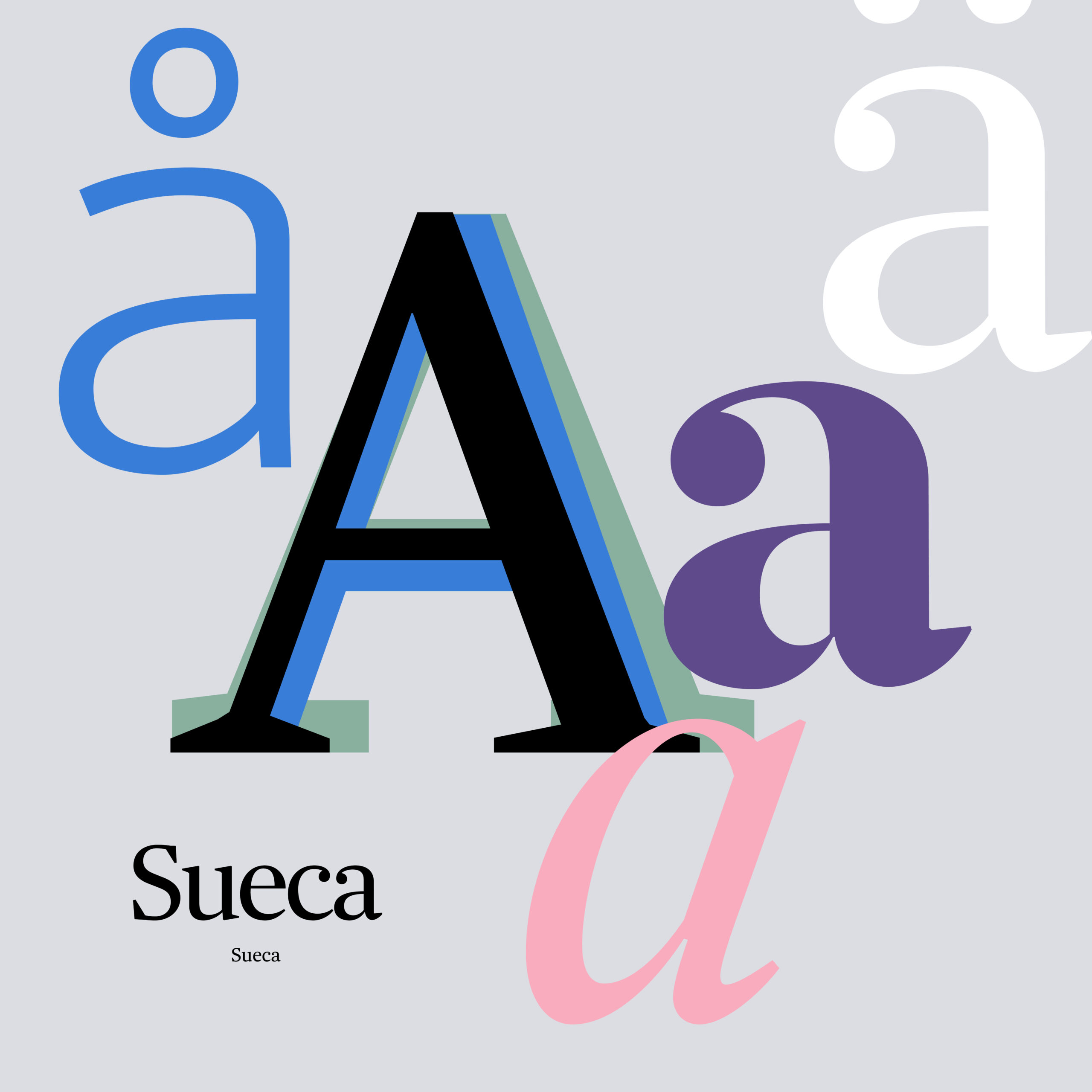
Sueca — The DNA of the news brand Svenska Dagbladet.
The custom typeface was commissioned for the Swedish newspaper Svenska Dagbladet in 2008. I directed the custom typeface development in a close work with typeface designer Mario Feliciano, Feliciano Type.
Today Sueca is the design DNA of Svenska Dagbladet, the one thing that give all different products of Svenska Dagbladet a clear connection.
It was a big step and decision to decide to develop a customised typeface and it was only possible with the trust and strong back-up by the Editor-in-chief: Lena K Samuelsson.
Type is critical and it’s the wheel, my main inspiration for the whole design, and Sueca inspired several redesign projects I conducted at SvD:
The projects are:
- Redesigning SvD in print, 2009
- Redesigning SvD in digital 2011
- SvD Insikt; awarded magazine iPad product, 2011
- Mobile site design and app updates, 2012
- Redesigning SvD in print, 2013
- Consulting SvD for the responsive site update of type, 2016
My aim with the new type design was to make SvD more unique, with a clear visual identity that stood out.
SvD has always been known for it’s sharp and intelligent style of writing and what could be a better way to express the quality of words than with a quality typeface?
Read more about the development of Sueca in the case study below.
View the project to develop the type in the design in the article:
A type innovation of a news brand
Case study
The main reference for the typeface design was the Forsberg typeface that pride Svenska Dagbladets title-piece; a distinct typeface. The Forsberg typeface is a capital alphabet with iconic values.
I was also keen on having a text typeface and headline typeface that somehow took more consideration into the Swedish language. A typeface for reading news with high legibility and readability.
To design newspapers it’s important with contrast so to design a typeface family came as a consequence but was driven by the curiosity of the type craft; what could Sueca become. The scope was to start with a serif typeface.
A typeface family without compromises
Sueca is a complex typeface that includes serif, sans and slab versions, but what sets it apart from other superfamilies is that each version was designed independently from the others, rather than being a derivation.
Sueca means Swedish in female form in Portuguese and is the title Feliciano, who is located in Lisbon, chose for the custom typeface.
Another consideration for Feliciano was to observe how words look in Swedish.
– There are some very odd (to me) combinations of letters in Swedish … another very important thing is the length of words. In Portuguese and Spanish we have very short words compared to Swedish.
One might think that for longer words a narrower font would be best, but Feliciano says; longer words need wider type so they can breathe. If you use a narrow font, long words become fuzzy.
»The design of Sueca was so far the most challenging and exciting type design project that I’ve been involved in«
Mario Feliciano
– I think I’m able to bring all my other interest into my designs in a very subtle way. My involvement in surf, music production, classic cars and even table tennis, certainly affects the way I design typefaces.
Sueca goes digital
One of my ambitions was to make Svenska Dagbladet clear on all touch points and in all products.
SvD was a pioneer, with an introduction of a web version of the customised Sueca, already in 2011 and the first news site in Europe, the first in US was Boston Globe.
In the work with bringing Sueca to digital and bringing Svenska Dagbladets digital design to the next level; I asked design consultant Mark Porter, MPA, who I admire for his work with The Guardian to work with me.
In 2015, I was consulted by Svenska Dagbladet for the new responsive site (svd.se) and type design. My role was to direct the design of all headlines and to direct the new web version of Sueca.
The new web version of Sueca was hinted by Göran Söderström, Letters from Sweden.
- Sueca was chosen for the issue 80 of Eye, 2011, a British design magazine specialised on typography.
- Sueca is also presented in the Swedish book: »Strindbergs lilla Röda«, 2019.
- Thurfjell held speech on Sueca for the Society for news design Scandinavia at the black diamond, 2011, Copenhagen and for Cap&Design at Berns, Stockholm in 2012 and a lecture on Sueca for Beckmans College of design, Stockholm.
- Thurfjell has been awarded for her work with Svenska Dagbladet by GYF, Sweden 2011.


