Print design system for 80 newspapers in Finland
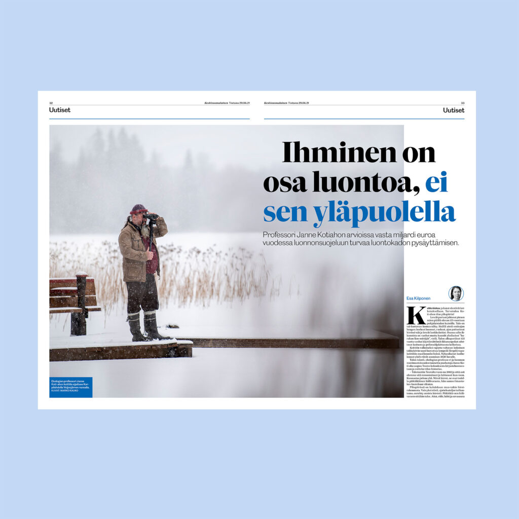
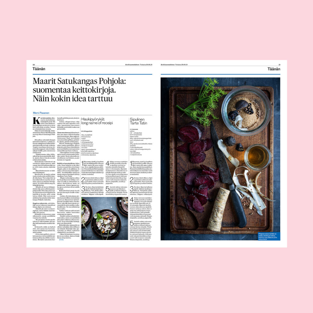
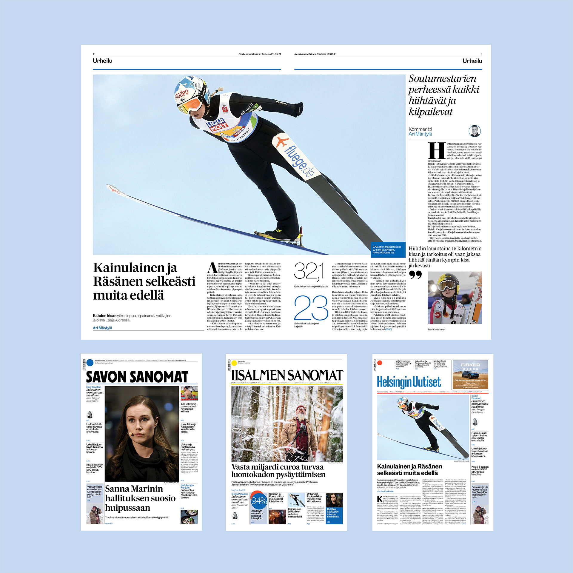
The project scope was; To create a new look & feel and to reform all Mediatalo Keskisuomalainen’s newspapers; nearly 80 into one design system; to share stories faster in the group and publish stories simultaneously.
The Finnish media company ”Meditalo Keskisuomalainen” translates into; ”Central Finland media” and is a media group with subscribed: quality regional newspapers, free locals and city news media.
The redesign focus in
- Streamlined design in how to structure stories and framing visuals
- Visual difference in between subscribed quality newspapers and free papers in the group with type and colour
- Improved legibility and and readability with a new selection of typefaces
The redesign is a full entirely new design for all newspapers, full restructure of all fronts, all page models including all ground design: type, grids, colours and framing all visual formats.

The Finnish language is very different, with very long words, which was challenging. The language is also harmonious and rhythmic giving a lot of new interesting angles in what typeface to use.
Designing with a strict timeline, the basis for the typographic research was off the shelf type. The restriction for the design was also that headlines should be able to shift in between serif and sans serif (for the subscribed papers and free papers).
I found a match between two typefaces that created a distinct and modern look, a clear contrast, high legibility and readability with the serif typeface: Majrit, Feliciano Type, and the sans serif typeface: Caslon Doric, Commercial Type.

This was part of a larger scope; To reform all Mediatalo Keskisuomalainen’s news products; over 60 websites and nearly 80 newspapers into one design system; where the main purpose was to share stories faster in the group.
View and read about the awarded multi digital system here: Digital design system for 60 news sites


