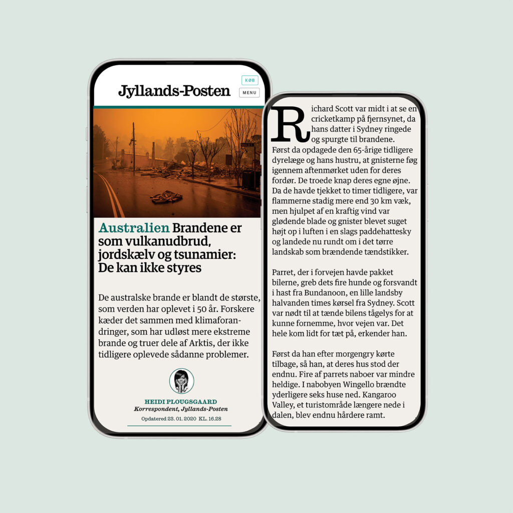
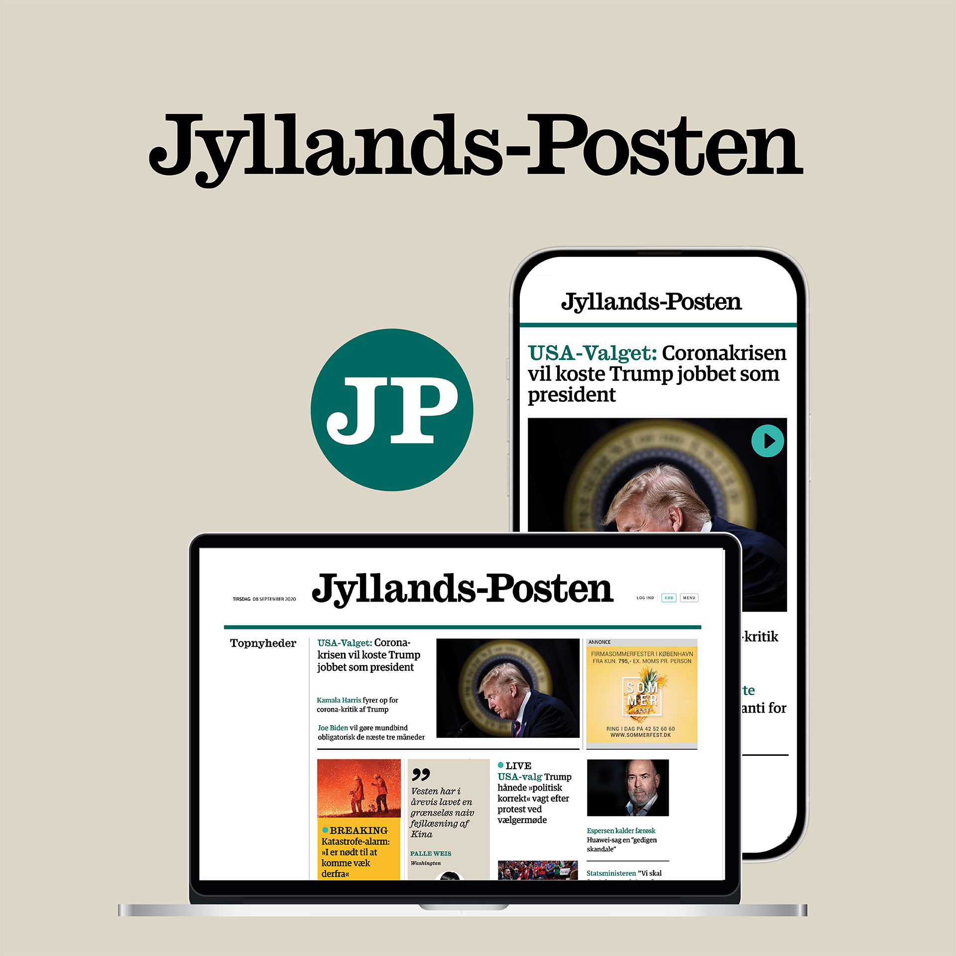
The scope was a digital redesign and an update of the logo design for danish news media Jyllands-Posten, jp.dk, to adapt to the digital needs. The main scope was to create a clearer hierarchy and contrast between different content on the digital front and create a stronger digital design DNA.
The project focused in:
- A new design concept for the front with more visual impact
- Recognition and a better branding with a new logo and abbreviation logo for video, SoMe and podcast
- New digital design with improved legibility and readability with direction of new typefaces
- New colour system based on Jylland-Postens main brand colour: The racing green.
- Visual sparring for the digital newsroom’s visual team, new visual formats and guidelines to photography, illustrations and infographics.
»With respect for the heritage of the brand«

For the update of the logo design I searched for that special historical key design element.
I looked for a typeface that spoke of the history of the brand and I found that in the new released »Cason Ionic« designed by Paul Barnes and Greg Gazdowicz, at Commercial Classics, is the new typeface behind the new logos and visual identity.
— You have had respect for the heritage of the brand — and you have helped us both graphically and conceptually to modernise the experience significantly with the user (that is at least our expectation) says Michael Jensen, former head of strategy, JP.


