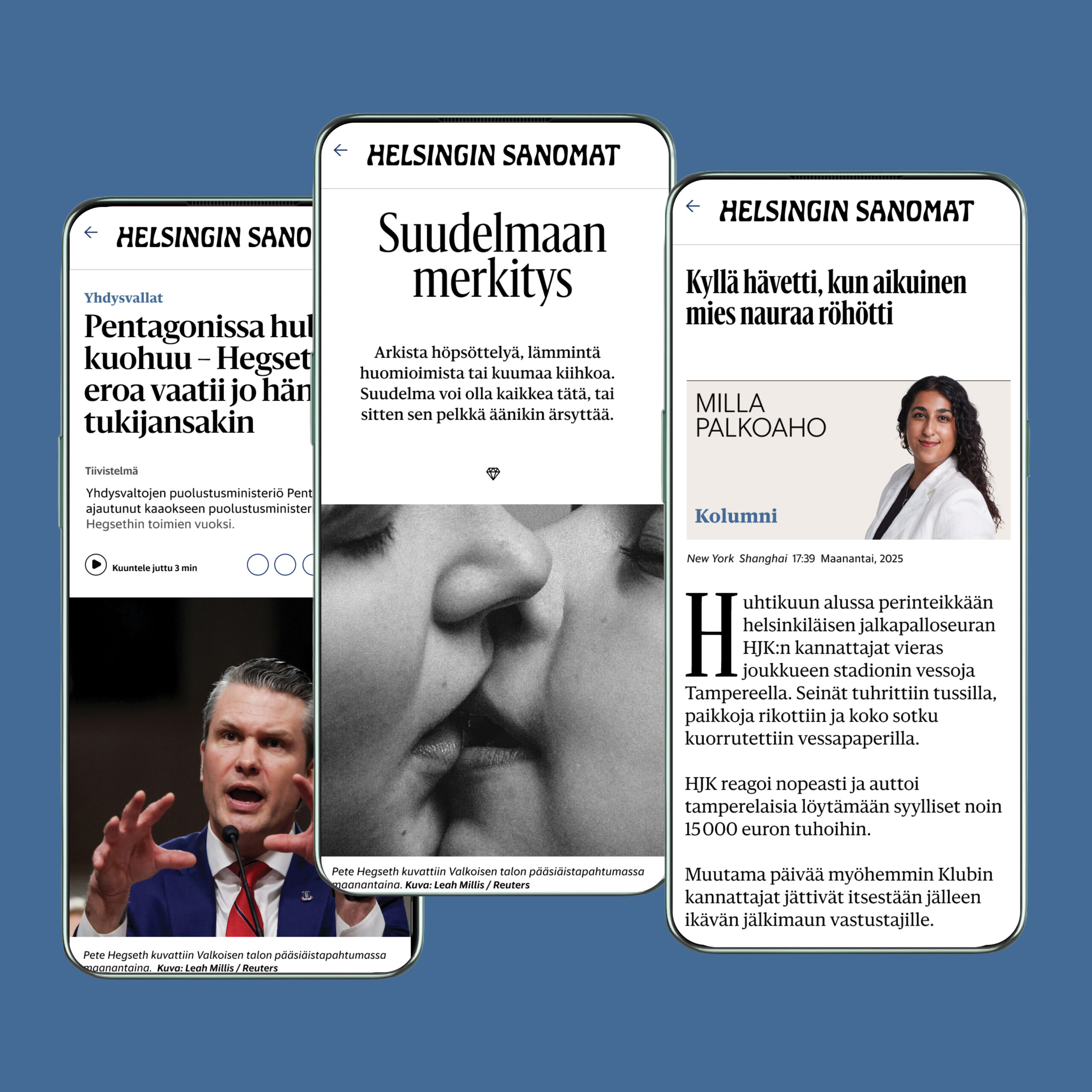
Helsingin Sanomat, Helsinki, launched a digital redesign. The stories are the heart of HS.fi, the largest quality news brand in the nordic countries with a reach of +14 M per week and a proud history dating 1889.
The scope is a new design system for articles and a comprehensive digital design guide for Helsingin Sanomat digital.
The aim is to modernise and improve the readability of online articles, differentiate the 3 main article types; news, feature and opinions and to clarify the story structure with a new grid system.
In the work of defining HS’s visual strengths, type is the most important with the heritage brand identity as the icing of the cake.
This work started out already in late 2023 when the editor-in-chief; Erja Yläjärvi asked the studio to do a brand and design audit focusing in digital and mobile first audience.
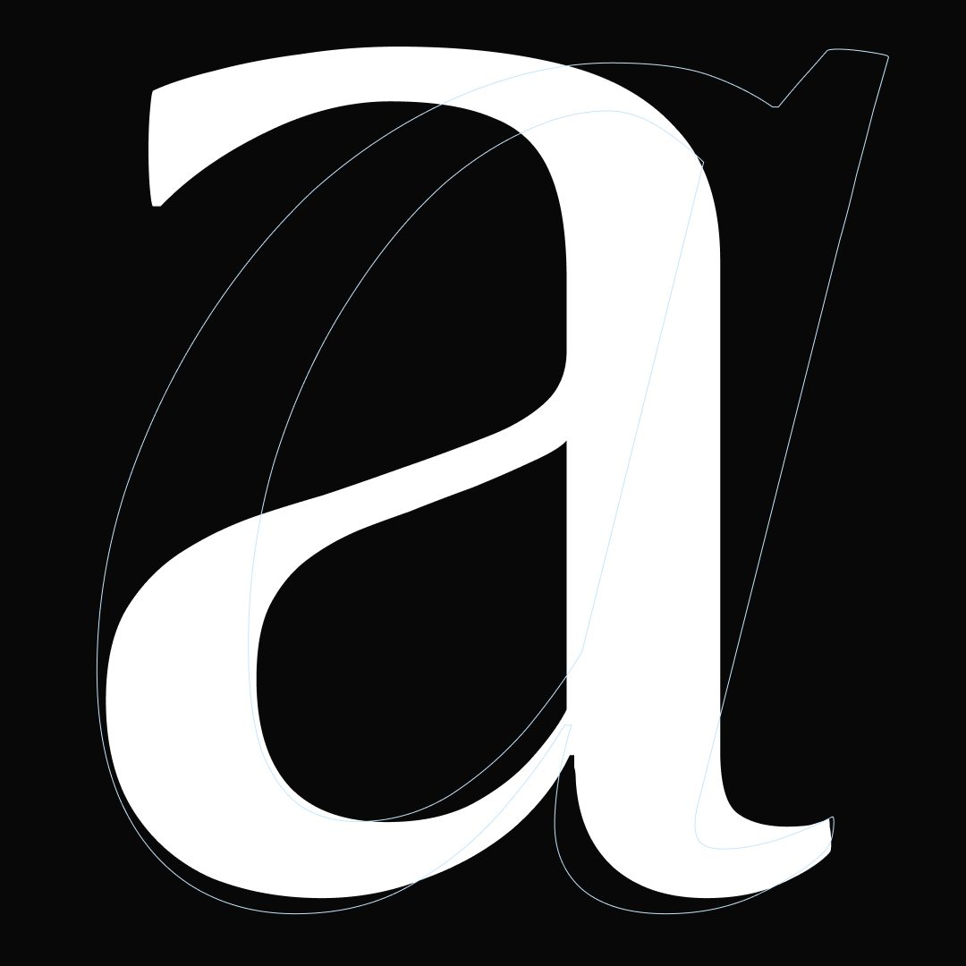
One of my discoveries was that the Sanomat typeface, is a very distinct and recognisable serif typeface.
New variable fonts
A critical part of the project was to take the next step on HS custom typeface and suggest building variable fonts optimized for digital and reading with Commercial Type.
»To me Sanomat is the voice of HS«
Says Paul Barnes, who designed it and he is proud to have been involved in creating a typeface that has become such a strong part of Helsingin Sanomat’s look; “Fonts and typography are central to people recognising the newspaper and the brand”.
»Helsingin has the simplicity of a geometric sans and the warmth of a humanist sans. It’s an ideal supporting character for Sanomat«
Says Christian Schwartz who designed Helsingin. The duo designed Helsingin Sanomat’s custom typeface family for HS tabloid redesign, 2013.
The legacy of these strong typefaces are improved and innovated for the digital news future. The new text typeface; Sanomat News Text, in the variable font: Sanomat News is designed for an optimised reading of articles in digital.
The full contrast of all headlines width and weights comes in the new variable font; Sanomat News Headline. The new variable font: Helsingin News is important for contrast, legibility, modernity, motion and inclusion. The new variable fonts are upright and italics.
Human touch
One of the team ambition’s with the design is to give HS digital design a human touch, with type, clear structure and strong visuals; to design a storytelling with purpose.
The colours are renewed, prioritised and bring more colour and life to stories, teasers and SoMe. The colours are inspired by Finnish nature and to look and feel natural. The main colour for news is the Queen blue.
Read more:
New Text Typeface For Helsingin Sanomat
HS interview with Paul Barnes and me translated.
Why variable fonts matters to news
View the studios new design in video at the studios site or YouTube channel.