


CASE STUDY In the mid 18th century in the midst of the industrial revolution a lot of newspapers in the world was founded. The Arts & Crafts movement flourished as a revolt, driven by the Renaissance ideals. The typeface of fashion in the newspapers in this time era was the blackletter and fraktur.
The journey of researching the American news type DNA took me all the way back to when the first American newspaper’s were born.
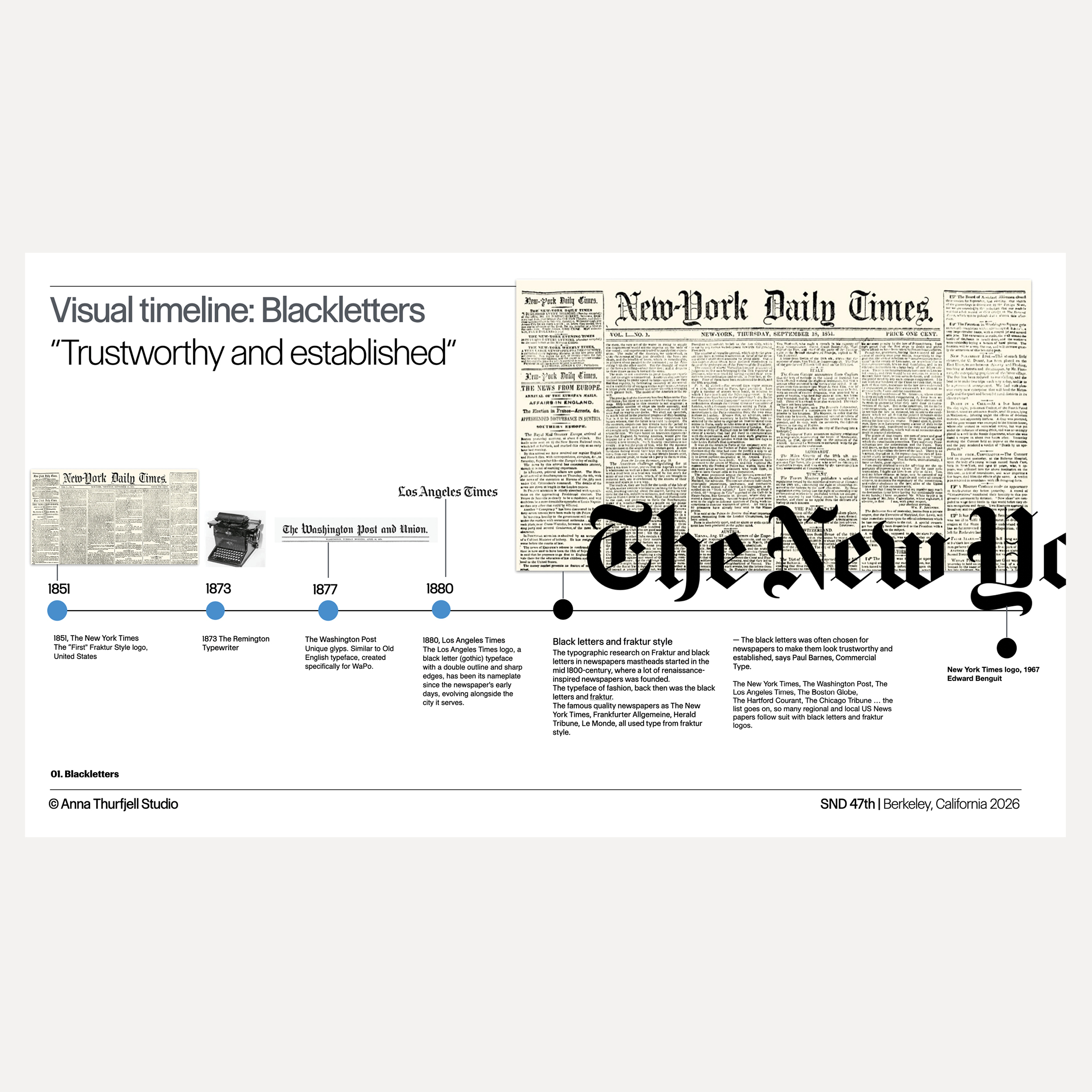
One of the earliest American newspaper with blackletter is The New York Times, founded in 1851. But why did the Times choose the blackletter? It was not new then. Blackletter were often chosen for newspapers to make them look trustworthy and established.
The Philadelphia Inquirer, The Washington Post, The Los Angeles Times, Chicago Tribune, The Boston Globe and many more US news papers followed suit with blackletter nameplates.
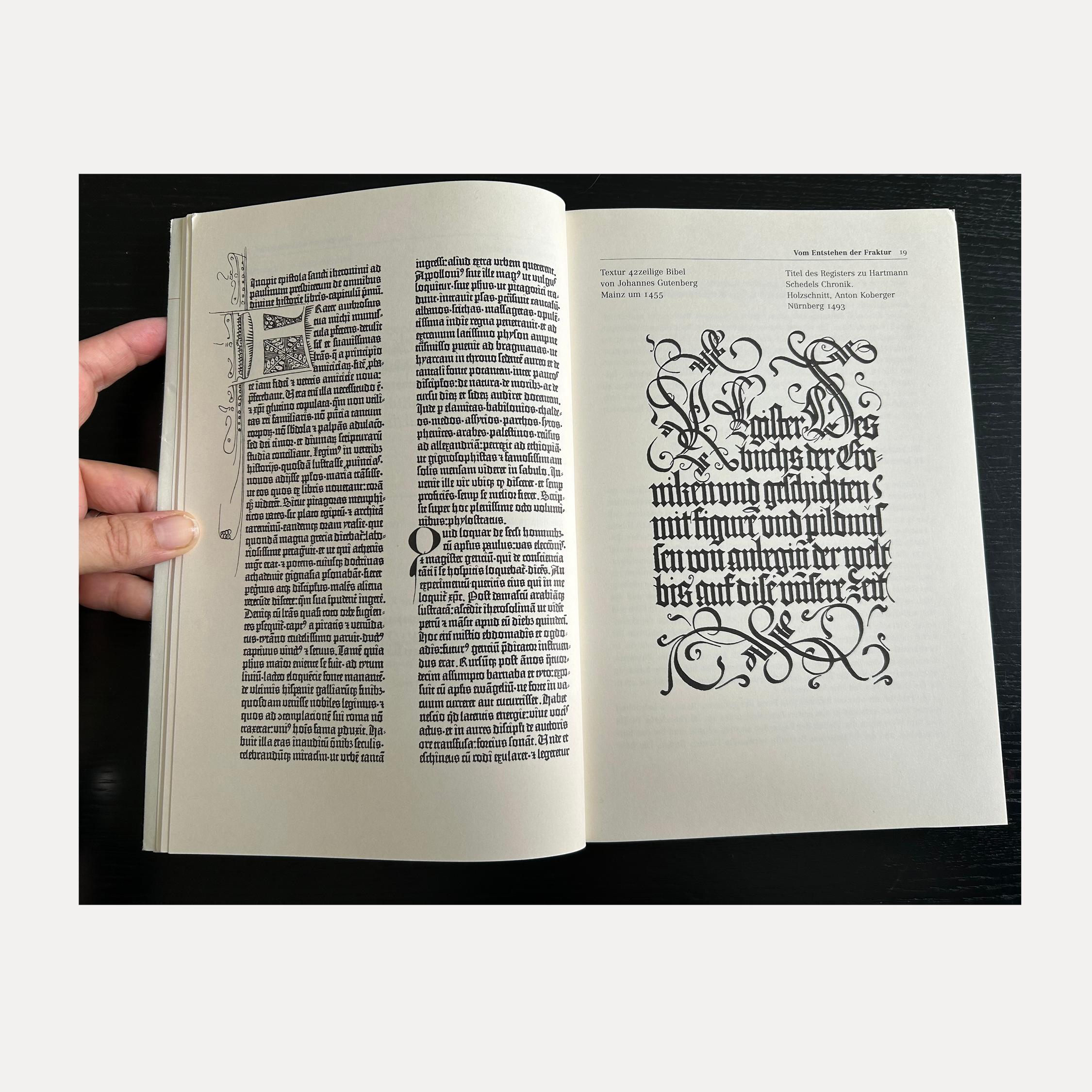
Blackletter heritage
Blackletter is deeply tied to newspaper heritage because it was the original typographic letterform used for printing in the western world, starting with the Gutenberg bible, 1450. That Blackletter style is called Textura.
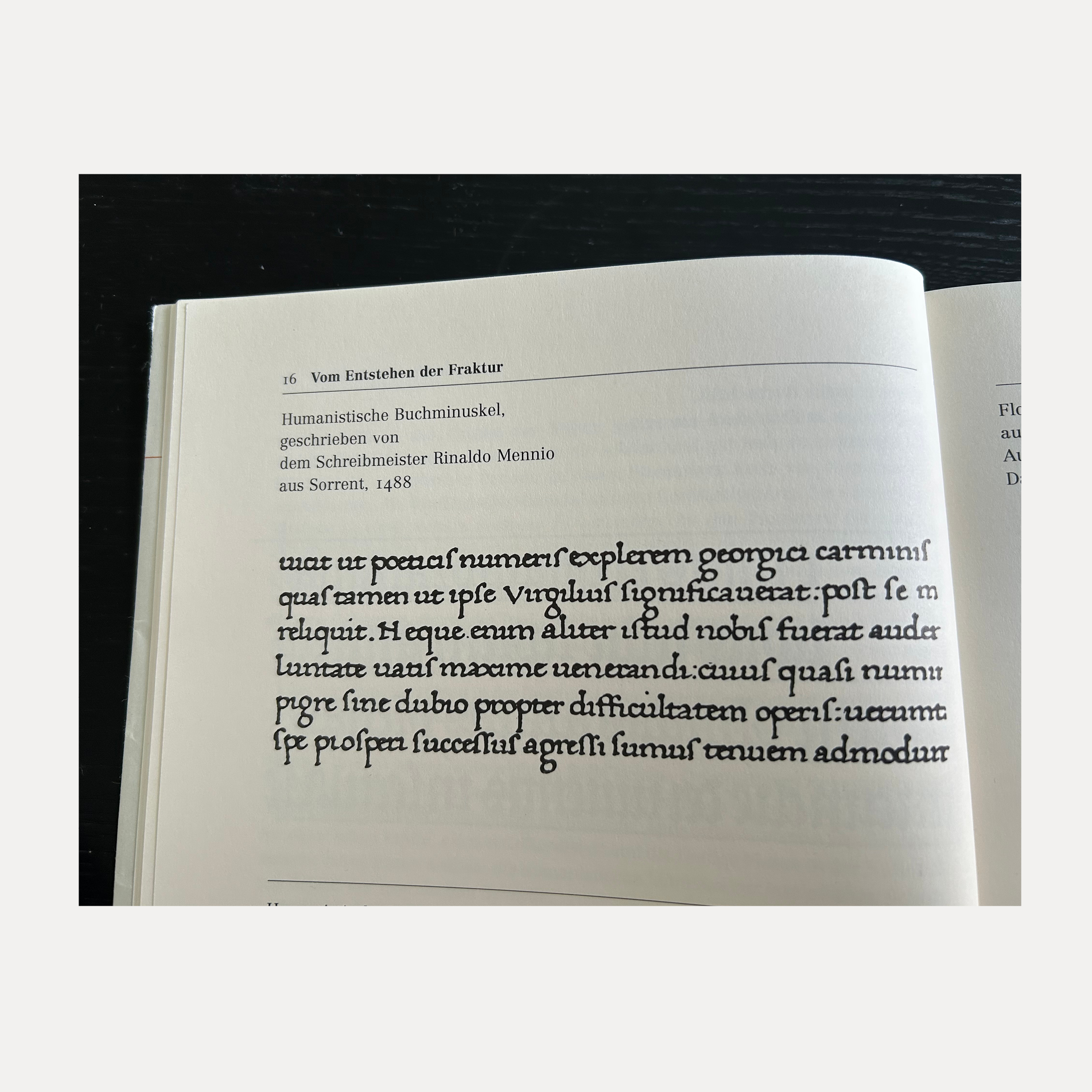
The typographic style blackletter is an evolution of the handwritten text in calligraphy style called Carolingian minuscule practised by monks in the Middle Ages.
Blackletters also made it into our modern time. We still associate them to the Second World War and heavy metal bands like ACDC but it’s become a part of modern culture and contemporary fashion too. Today music like D’angelo and beer brands like Mexican Corona and T-shirt brands label themselves with blackletter.

Even as other newspapers adopted new type for the newspapers logos, The New York Times and many of the American newspapers kept the blackletter in the nameplate with only few modernisations. These blackletter logos captured the authenticity of the past and gives historical weight and a trustworthy branding. That’s how the blackletter became newspapers heritage.
The succesful modernisations of the historical newspaper nameplates were designed by American masters of calligraphy. The legendary Ed Benguit, redraw The New York Times nameplate, 1967. The lettering artist Jim Parkinson drew many of the iconic American news and magazines nameplates. In this study we looked at his work with; Los Angeles Times and The Washington Post.
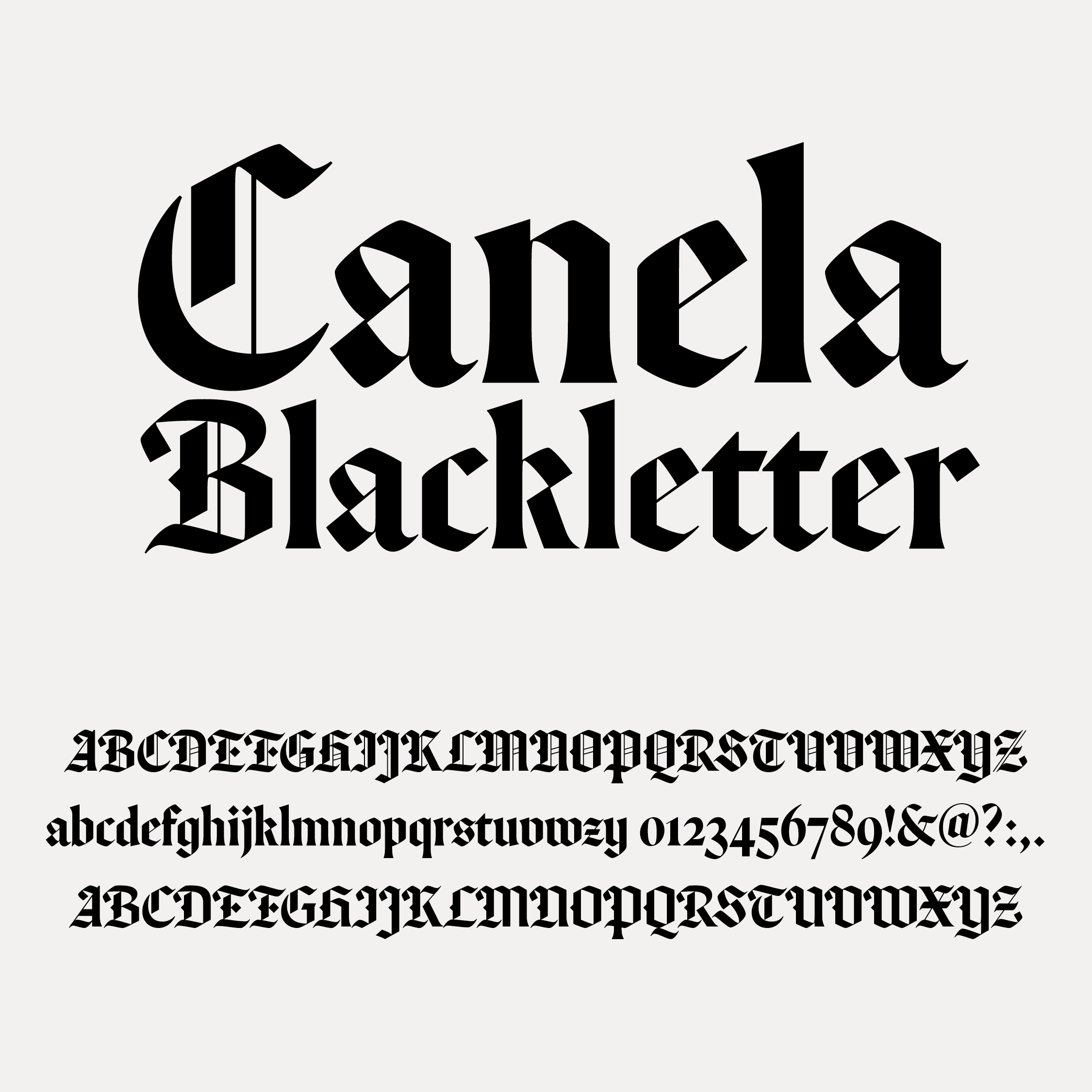
The typeface Canela Blackletter, that the studio suggested for The News in Briefs is designed by Miguel Reyes, Commercial Type and based on textura style. We were drawn to the flat and graphic simplicity of this blackletter style that manage to capture the look of history and yet to feel modern too.

The News in Briefs
- Read the full article on the studios design project
- View the new product brand and design in this video
- The power of news photos