Im happy to share the news my studio directed and designed the refresh of the news brand Aftonbladet. Aftonbladet is Sweden and the Nordic countries largest breaking news brand.
It’s a rare project to direct and design a refresh of such a known and iconic public brand.
This is also Swedens oldest news brand, founded in 1830 by Lars Johan Hierta, a radical who wanted to modernise Sweden and society.
Hierta was a champion of the free speech and brought the freedom of expression to everyone in Sweden. Aftonbladet got the most influential and largest news brand back then and it still is the loud, large and broad media voice.
In the initial part of the project I conducted a design and brand audit of Aftonbladet focusing in digital and mobile first.
The logo study showed a remarkable consistent typographic visual identity yet also that the visual brand and logo simply wasn’t powerful enough for the digital age.
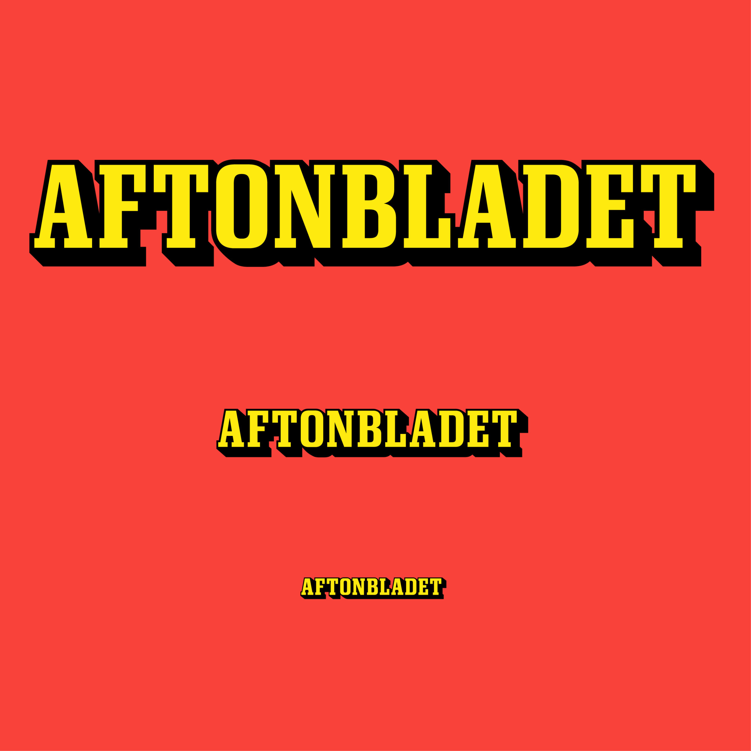
The logo had clear limitations as a readable font and was a clear diminution of the brand in smaller sizes such as mobile screens.
News brands with trust
The brand audit also pointed out that heritage and history are key to Aftonbladet. Part of the brand’s credibility and appeal lies in its ability to remain relevant to the times it operates in and how it manages and continues to develop the brand’s equity.
The project scope of Aftonbladet brand refresh was to create a logo design that works for the visual brand design in 360 degree to all products, sub brands and communication.
An equally important media brand is Sportbladet, Swedens largest sport destination that my studio also designed.
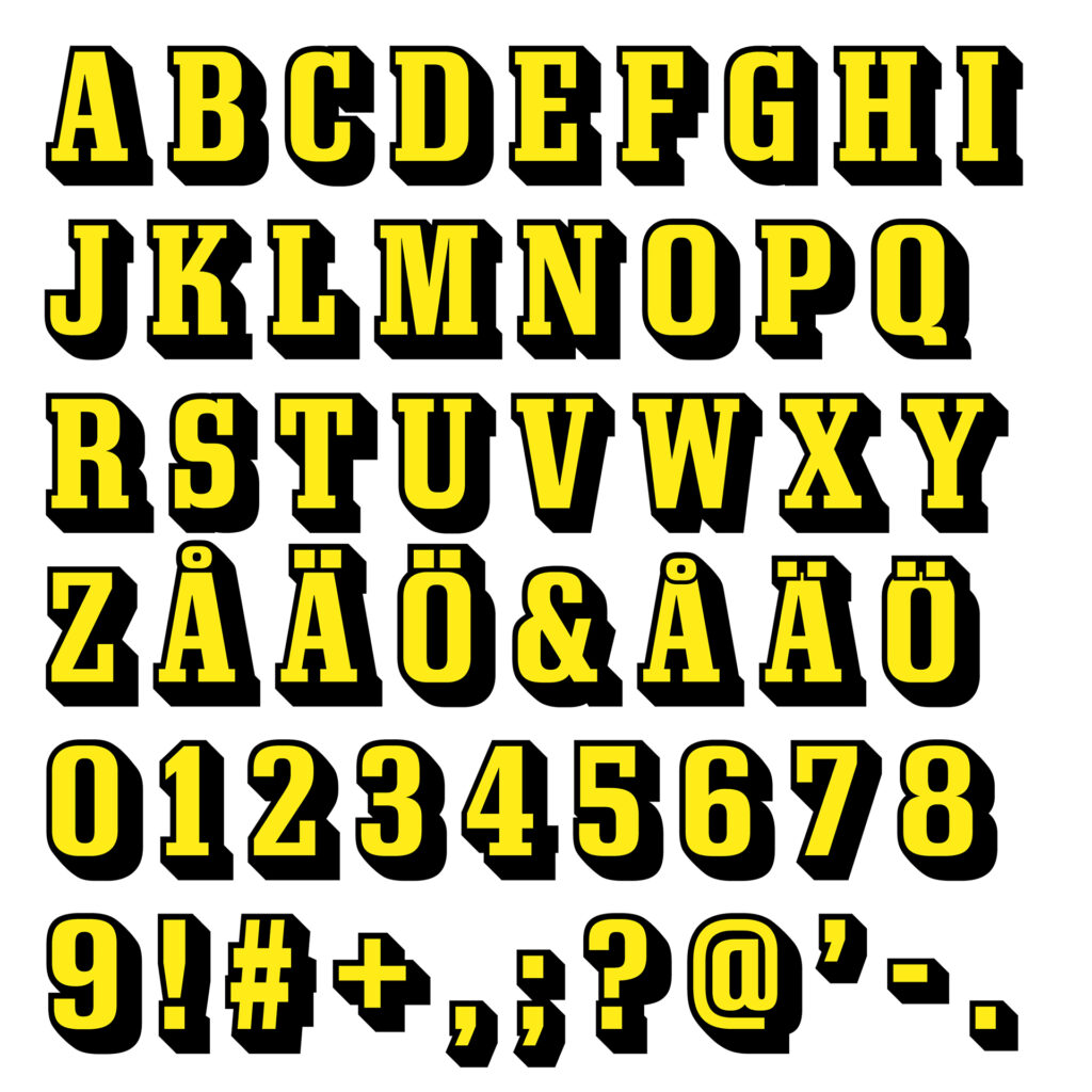
To keep the brand coherent and prepare it for future needs I directed the design of a new logo typeface.
To create a trustworthy logo and brand design for a news brand its important to:
Respect the past, stay relevant in the present time and prepare it for the future.
My aim was to give the logo strength, more punch and become visually clearer and immediate for breaking news in the digital age where a story breaks in SoMe and video.

It’s slab serif, yellow and shadow
I asked Christian Schwartz at Commercial Type, if he could redraw the logo and logo typeface, and I’m glad he accepted the challenge and on the project he says;
”This is an evolution of the logo, looking back to its history to understand how to bring it forward. The craft has been improved, along with the function”
Commercial Type has built its reputation as one of the most respected type foundries in the world and my design studio has successfully collaborated with Commercial Type on several brand and news design projects over the years.
For experiment Schwartz and Greg Gazdowicz, suggested to build a variable font which became an important part of our method and together we explored the typographic axes and design space.
Based on the new logo design each letters of the new logo typeface emerged. Read also the case study by Christian Schwartz on the typeface design for the logo and logo typeface for Aftonbladet.

Own a letter in the alphabet
It’s powerful to own a letter in the alphabet and I suggested Aftonbladet to go for a one letter abbreviation logo icon so it would become much clearer in every touch point. It’s what modern news media need to break in SoMe, videos, broadcast, on site and beyond.
Aftonbladet’s new logo is developed with a holistic approach to work for all products and across all touch points. Size matters and to optimise clarity on small screens the logo is now available in sizes: S, M and L. S for mobile screen, M for desktop and L for a tabloid print logo and beyond.
I’m a speaker at a global type conference ATypI 2025 Copenhagen the speech will tell about how to create news brands trust and reveal: the key findings in the brand design audit, observations in the history type study and the method behind; The Refresh of the News Brand Icon Aftonbladet”.


