Every typeface has a story.
The idea was to create this book project in a sort of cross thinking way; The typeface; Parnaso / the ancient world of Parnassus.
During the design process we became more aware of the meaning of the Parnaso — Parnassus in English — And some of the deepest mythic places of classic Greek culture.
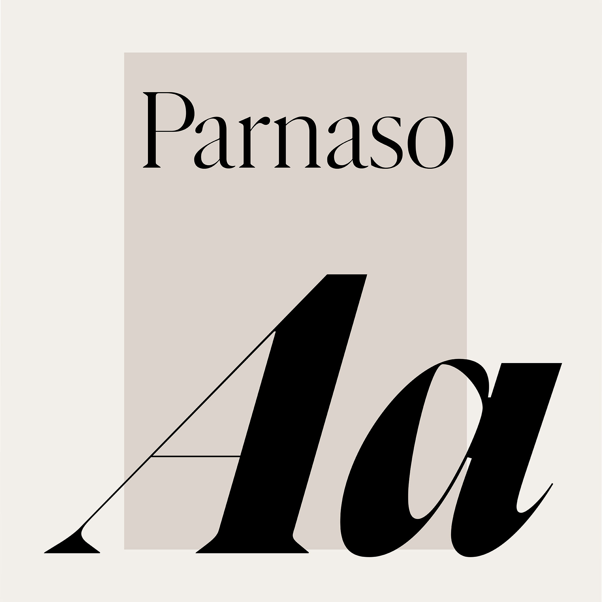
Parnaso is a typeface designed by Feliciano Type.
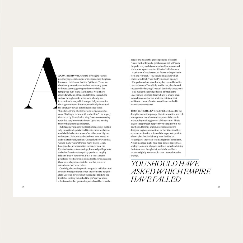
»A completely free project where I treated each page of the book as a white canvas where I painted with the Parnaso typeface«
Welcome to merge into the world of Parnassus;
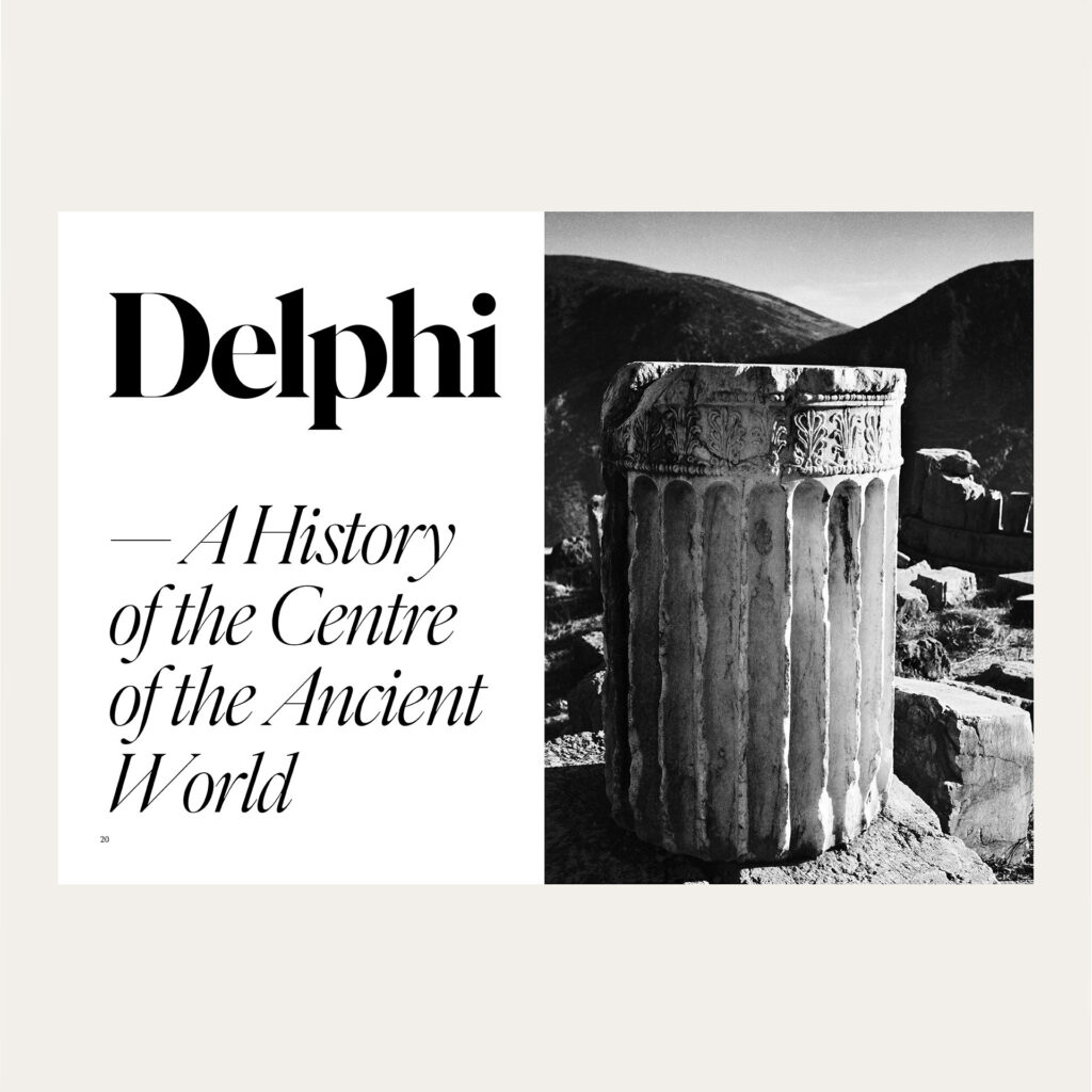
The cover story is from The Guardian; a review of the book; “Delphi a history of the centre of the ancient world”, visualised with an Ionic drum column, shot by the legendary photographer: Herbert List, @Magnum, Paris.
Delphi, i.e Parnassus, was a hexagon column temple building, and its today mostly vanished and what it really looked like can only be reimagined.
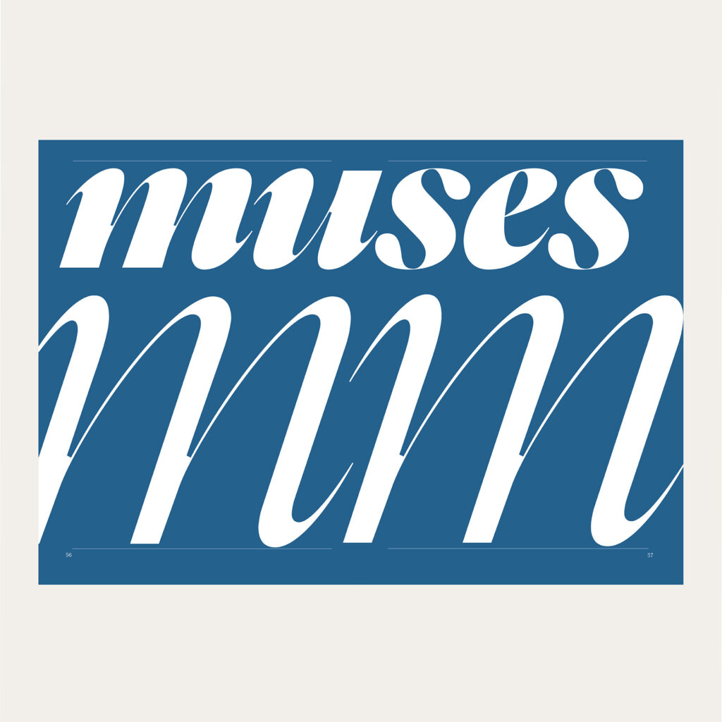
Type is music and in fact the word; “music” derives from the word; “muses”, once singing in Delphi…
Words; The foundation and principles of classic architecture was created in these temples in Greece.
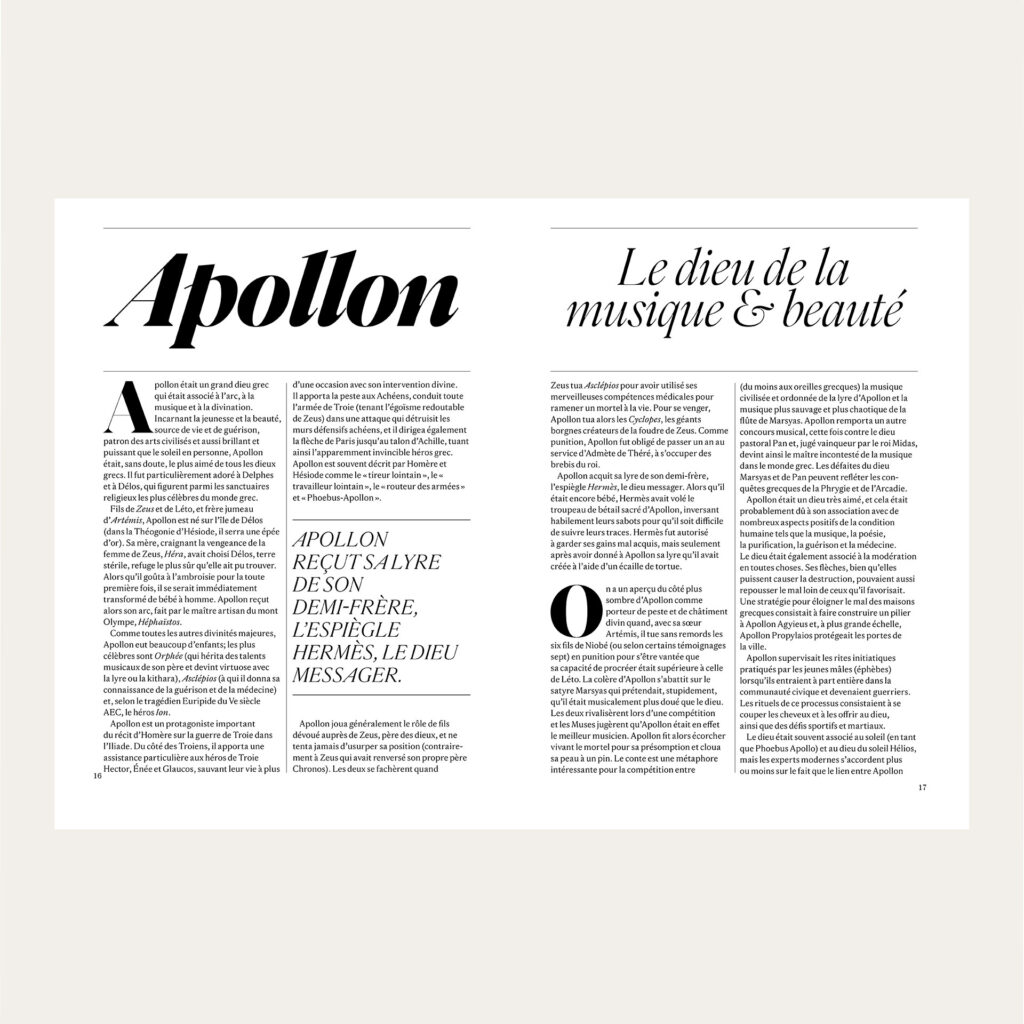
Apollon, a piece in french, by Marc Cartwright, The World History Encyclopedia.
Apollo was the god of beauty and music but also the main pop star of the greek gods of these times, worshipped in the temple.
The typeface Parnaso is a homage to the myths of Parnassus and its also the name of the bookstore; Parnaso in Lisbon, where Feliciano once layed eyes on books typography and the world of typefaces.

“Não pare o tempo” means; “Don’t stop the time”, in Portuguese. To design typefaces Feliciano style demands time and the skills.
The photo of the Atlantic ocean, is shot by: Helder Luis, Lisbon.
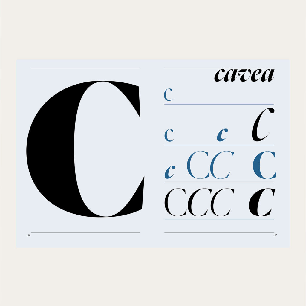
The book design uses black and white with one colour; the same blue colour nuance; that was used to paint the greek temples. Blue was believed, in ancient times; a holy colour protecting from dangerous spirits.
Obrigado mestre Mário, Thank you master Mario for the project.


