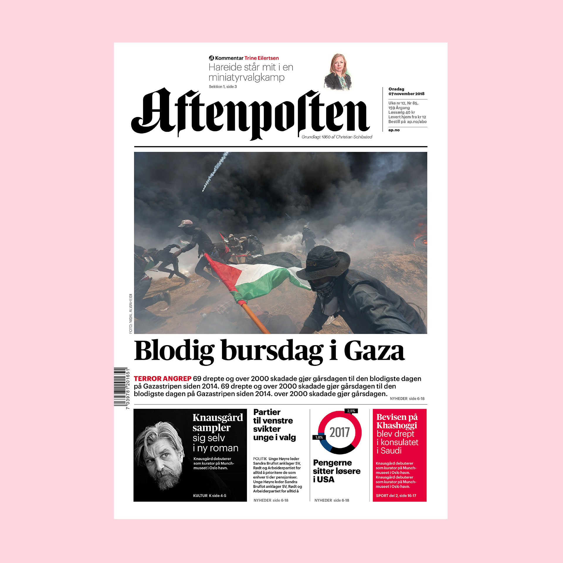
The scope was to modernise the quality newspaper brand Aftenposten focusing in a print redesign where the new look and feel, the design DNA; brand, typography, grids, visuals and colours, should work 360 degree; for digital and print.
Aftenposten is a Nordic newspaper icon, founded in 1860, in Oslo. Still today it’s Norway’s largest daily quality newspaper with over 1,2 million readers in print and the digital ap.no.
The overall goal with the redesign was to: Keep a connection to the history, make it work in the present and prepare it for the future … The loyal readership of Aftenposten should feel that the exclusive relationship is maintained but lifted up to higher level of experience.
The awarded print redesign focused in:
- More impact, recognition and better branding with a redrawn logo and title-piece.
- More clear, strong and classic news front page.
- Modern and distinct type with a higher contrast, improved legibility and readability. All typefaces are designed by Commercial Type.
- A new structure system for news stories with more range and dynamics. More levels within stories, like fact boxes, maps, and pull-quotes.
- Stronger and fewer visuals, better infographics and intelligent illustrations.
- A warmer visual voice with illustrated bylines for all of Aftenpostens profiles drawn by the acclaimed Japanese portrait illustrator Masao Yamazaki, Tokyo.
- More modern yet still a classic newspaper look.
Read about the work to direct Aftenposten brand and logo, see link: Revival of a heritage news brand


