Magazine design and art directing illustration
Magazine design needs continuously development to look and feel contemporary, a magazine that is part of its time is more relevant for its readers.
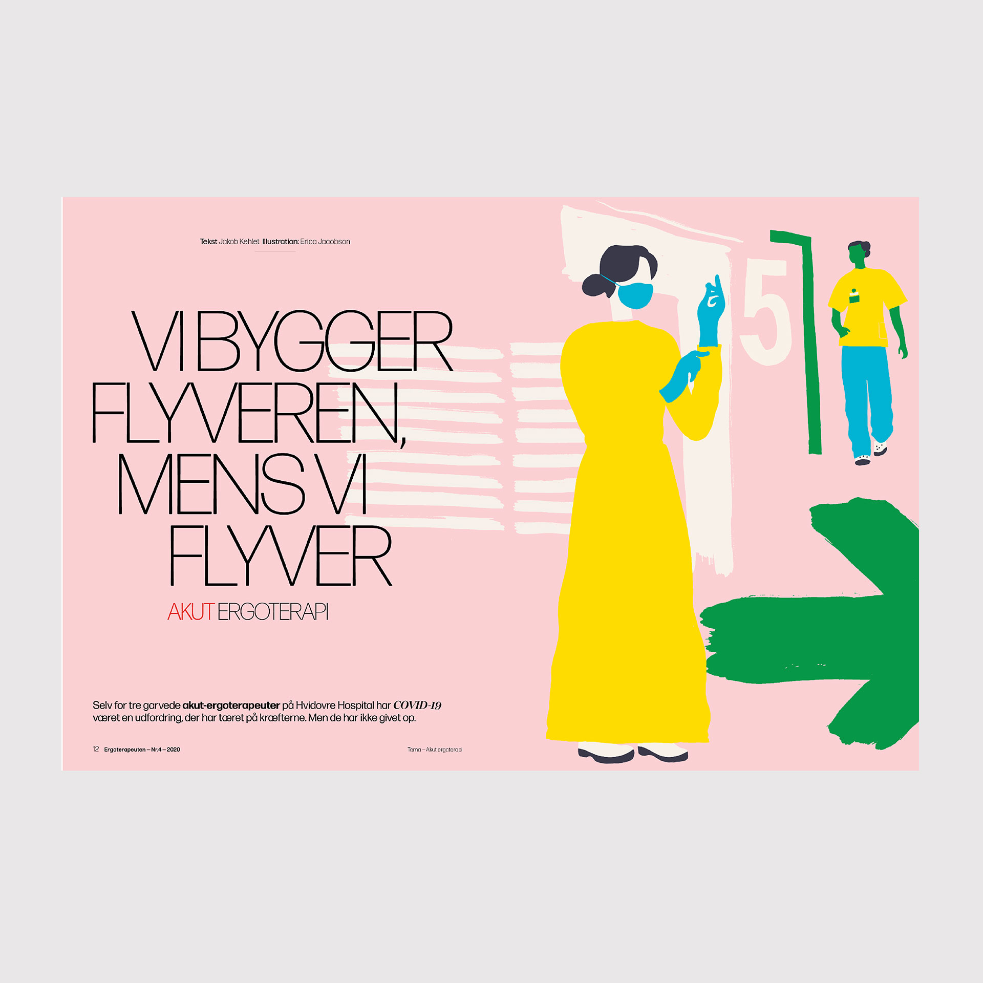
My studio did a magazine redesign update for the magazine Ergoterapeuten from Ergoterapeutforeningen, Denmark, 2020 and art directed and designed the magazine the following two years.
To art direct the 4th issue in 2020, during the pandemic and lockdown was the most developing challenge, the full issue was illustrated stories.
I worked with the illustrator: Mazao Yamazaki, Tokyo and the illustrator Erica Jacobsen, Stockholm. (Visuals: Erica Jacobsen).
The magazine type I directed is Forma, a stylish revival of the classic Italian sans by David Jonathan Ross and Roger Black, US, and the serif typefaces; Domain and Feijoa, Klim Type.
I art directed and designed the magazine over a two years period with designing the magazine for 8 issues yearly.
The studio also redesign a new concept for a stand alone yearly magazine in research called Forskning (Science research):
»What does occupational therapy research really look like«
How does it feel?to create the framework for the Occupational Therapists’ Association’s new research magazine.
– I thought about how research visually looks to me, and my references were the old science drawings from especially the Italian sculptor, painter and scientist Leonardo da Vinci as well as the German biologist and philosopher Ernst Haeckel.
Their drawings are in many ways the explainers of the past.
– For the occupational therapy research magazine, which in a way should also be able to function as a kind of explainer for the subject, I would try to combine the feeling from the old masters’ often slightly technical science communication with a feeling of something more human – the hand, the way we move us on…. It must not be too technical or clinical, because that’s not how I see occupational therapy.
I found illustrator Sidsel Brandt, who specialises in making anatomical drawings of both humans and animals.
However, since the theme of the first issue is about aids in research and practice, we had to find a visual idea that was not only based on anatomy, but could reconcile the look and feel of the old science illustrations with present and future aids, and therefore it became visual element an exoskeleton – a future aid interpreted in a slightly past, anatomical line, explains Anna Thurfjell
The Japanese artist Masao Yamazaki’s fine portraits of many of the researchers gave the magazine a warmer voice.