Svenska Dagbladet is Swedens main conservative quality news media, founded in 1884. Heritage and history are key to Svenska Dagbladet.
Part of a brand’s credibility and appeal lies in its ability to remain relevant to the times it operates in and how it manages and continues to develop the brand’s equity.
The logo is the most important visual brand asset and it was something I focused on in several redesign projects between 2003 — 2013, when I was Creative Director at SvD.
The value is trust and the idea behind the redraw was to gain a brand with improved trust and a strong coherent logo on every touch point.
The aim with the brand design was to create a distinct look & feel with the use of the same type identity for all SvD products, sections heads and magazines titles across all products in print and digital and beyond.
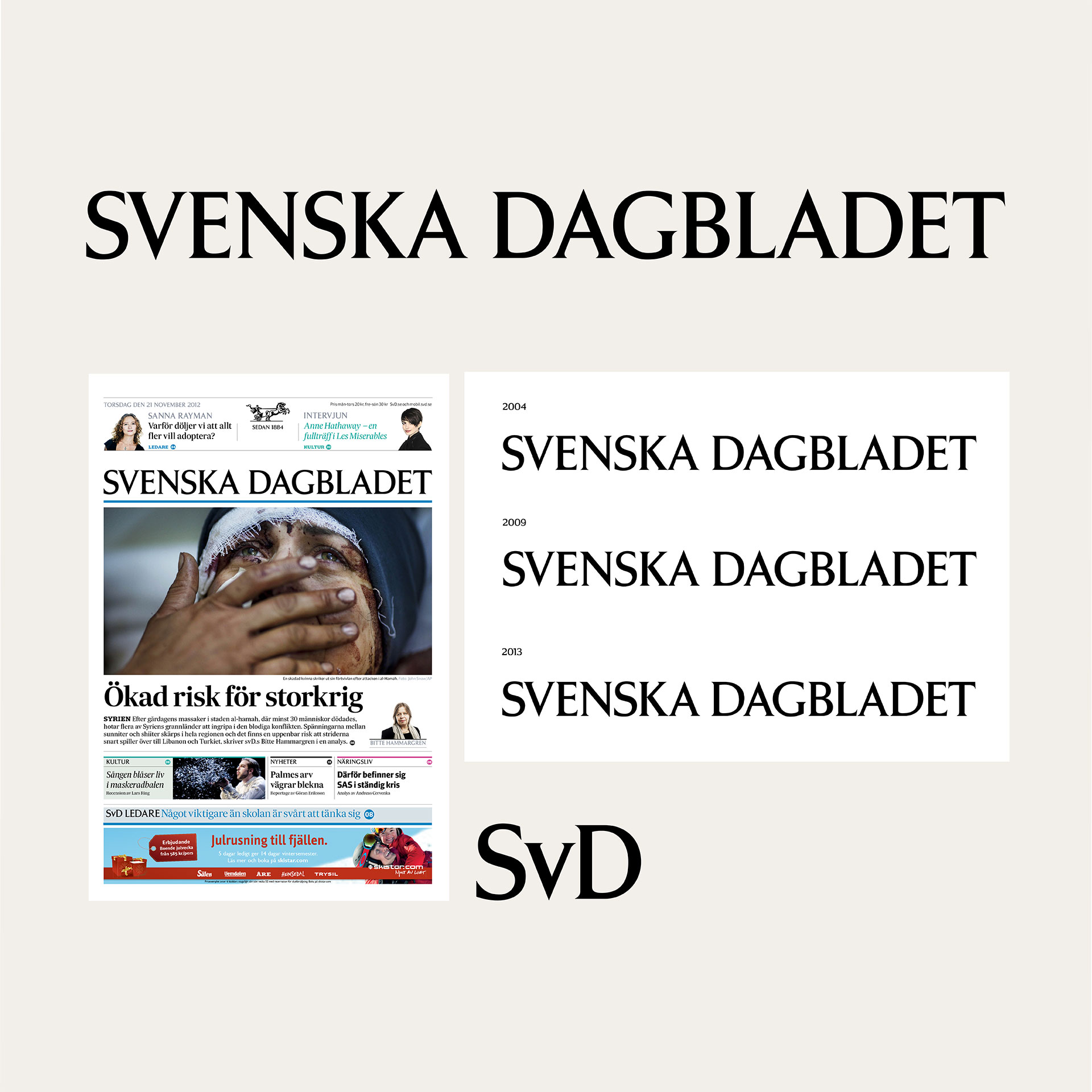
The Svenska Dagbladet title-piece was carefully renovated and very carefully adjusted, in three periods, (2004, 2008, 2013). The main redraw I directed was designed by Swedish typeface designer Örjan Nordling (2004) a specialist on Forsberg’s work with the knowledge based on the craft of a new edition of Forsbergs typeface; »Berling Antiqua« in digital called »Berling Nova«.
I also directed adjustments of the Forsberg alphabet typeface: »Forsberg SvD« owned by Svenska Dagbladet. These adjustments were made by the Swedish typeface designer Mark Winelid, Typecraft AB, who also digitalised and redraw the original Forsberg typeface back in 1995.
In the work with modernising Svenska Dagbladets typeface I studied how to keep and maintain the title piece designed by Forsberg by researching the Forsberg typeface and his typographic work.
View and read also about Svenska Dagbladet design in the article: A custom type innovation of a news brand.
The culture magazine design: Magazine design with type personality

Forsberg — A distinct type
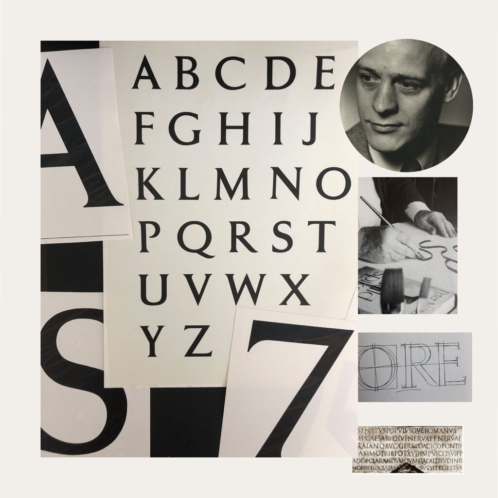
The beautiful alphabet design called »Forsberg«, is an exclusive design for Svenska Dagbladet in the 1960’s.
The letterform inspired by the Roman capital letterform and is a very distinct letter design just like the famous letters inscription on Trajan column in Rome.
There is so much to say about Karl-Erik Forsberg, (1914-1995), whom is considered one of Sweden’s foremost typeface- and graphic designer.
He was also a great calligrapher, painter and teacher. I can only give you a »glimpse« into his distinct type work.
Forsberg did a number of typefaces: Parad, Lunda, Carolus, Ericus and the famous Berling Antiqua, 1951; a renaissance typeface drawn with the purpose to be used for the Swedish language.
Forsberg also worked as the artistic leader at the book publishing companies Almqvist & Wiksell and Norstedt.
The book design of the »Bible«, 1954, with images by Rembrandt is considered one of his greatest work and was designed with his own typeface Berling.
That he was a great calligrapher is visible in all his design. He designed a calligraphy look for the Nobel Prize Physiology and Medicine diplomas, that has been consistent in the look, since 1965.
In 1974 he received the title Royal graphic designer, which is really a story of it’s own. As a Swede, you could not have missed to have seen his logotypes around you.
For instance he draw the clear monogram logotype: »SR«, Sveriges Radio (Swedish Broadcasting) and Forsberg also designed the logotype for »Volvo«, to just mention two very distinct logotype designs.
If in Stockholm, you can view the type, carved in stone at: Riksdagen (The Swedish Government), Helgeandsholmen.


