Aftenposten is Norways largest quality news media, with over 1,2 million readers in print and in digital ap.no . It is the oldest news brand, in Norway, founded in 1860. Heritage and history are key to Aftenposten.
Part of a brand’s credibility and appeal lies in its ability to remain relevant to the times it operates in and how it manages and continues to develop the brand’s equity.
The logo is the most important visual brand asset and it was a rare project to direct a redraw of a true heritage brand. The value is trust and the idea behind the redraw was to gain a brand with improved trust and a strong coherent logo on every touch point.
The project scope was with the redesign project, launched in 2018, that my studio did, was to keep a connection to the history, make it work in the present and prepare it for the future.
The loyal readership of Aftenposten should feel that the exclusive relationship is maintained but lifted up to higher level of experience.
The project was part of a redesign of Aftenposten and the overall aim was to connect the brand in digital print and beyond.
Read the case study, below and the work I did with direction the redraw with Commercial Type.
View also the project Redesign of a Norwegian quality newspaper

Case study
WHY? To safeguard the heritage brand
After a couple of decades of galloping digitisation, restructuring and modernisation needs in the media industry, it is Aftenposten’s style, tradition and identity that must be clarified.
Aftenposten is the oldest newspaper in Norway, a Scandinavian newspaper icon, founded in 1860, in Oslo. To show it’s history does not keep it from being modern, in all journalism and publishing, it makes it more trustworthy.
I made a discovery when I was researching old versions of the Aftenposten logo.
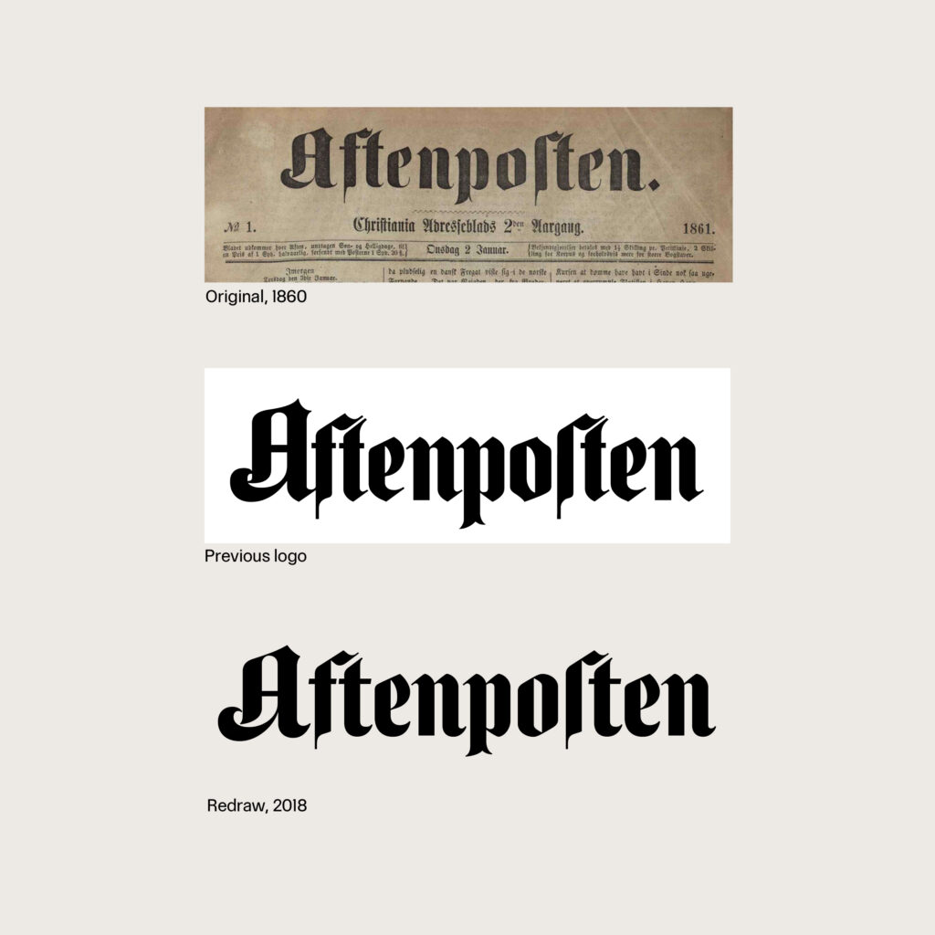
— The original logo was softer. Airier, more graceful in the curves. And more like old handwriting, as the idea was probably originally.
So I suggested to redraw the Aftenposten logotype and title-piece and to make the title-piece more prominent again. I showed that if the full name »Aftenposten« returns in its full width at the top of the page or header it creates a clearer branding in both print and digital.
Ultimately this was a way for Aftenposten to safeguard their fine and original heritage brand.
London calling
The perfect man for the job description was the British typeface designer Paul Barnes, Commercial Type, he described the redraw challenge like this:
»The original Aftenposten is expressive and distinctive, capture the qualities of fraktur, black letters and the human penmanship«.
On a hot and beautiful summer day in June, 2018, Editor -in- Chief: Espen Egil Hansen and I, together with Aftenpostens photographer: Paal Audestad, went on a logo trip to London to meet with the typeface designer Paul Barnes.
Hansen had brought a surprise package with him for Paul to unpack; the very first book with fronts of Aftenposten from the archive in Norway. Together we discussed Aftenposten’s ’A’ and rare ’s’ with the expert Paul Barnes.
Hansen asked Barnes: What is your personal opinion about the long, weird ’s’?
— It is more special than most ’s’, and mirrors the ’f’ in the logo. People accept it without caring. But if we had started with blank sheets today, no one would have written it that way, says Barnes.

Read Aftenpostens exclusive story on the London meeting with Paul Barnes.
Black letters and Fraktur
The typographic research on the Aftenposten title-piece, took us back to the era of mid 1800- century, where a lot of renaissance-inspired newspapers was founded. The typeface of fashion, back then was the black letters and fraktur.
The famous quality newspapers as The New York Times, Frankfurter Allgemeine, Herald Tribune, all used type from fraktur style.
— The black letters was often chosen for newspapers to make them look trustworthy and established, says Paul Barnes. The seemingly unchanging logo with the kind swoosh ‘A’ and the strange, vertical s was not as unchanged as many might think.
In my research I found out that the Aftenposten newspaper title-piece had actually changed shape a total of 19 times since its inception in 1860 — and that it was basically more beautiful before.
The new redraw of Aftenposten logo is slimmer and more beautiful, ‘A’ is slimmed down, the tall, old ’s’ is kept. Hopefully the grace is back and readers can sense Aftenposten kept its history and modernised for today’s need.
It was an extensive work that Barnes did, when we had chosen what direction we wanted I directed Paul to design various variations within that direction, to test what weight and height that best suited the new Aftenposten title-piece and logotype.

Logo to all touch points
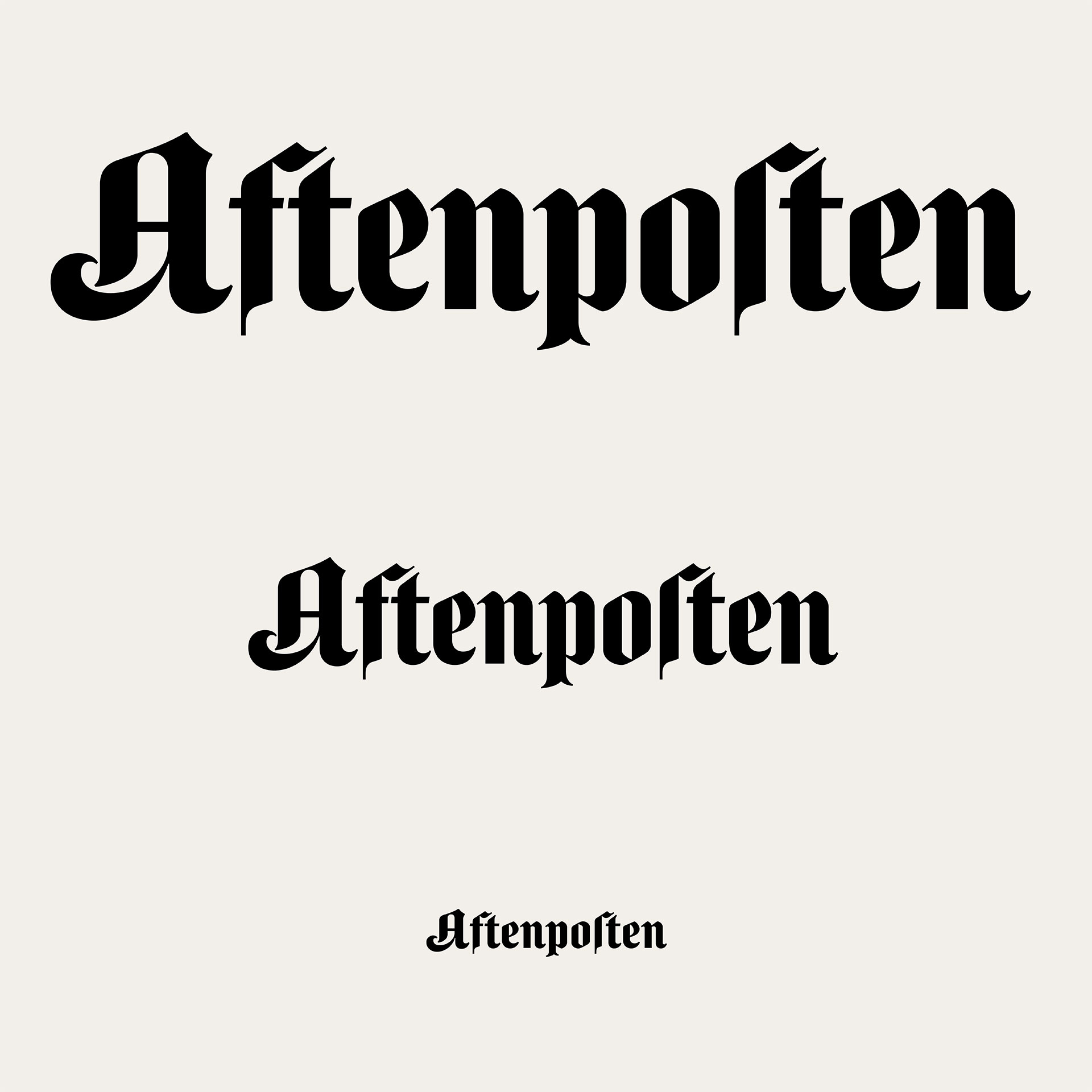
The new logotypes are designed to work for Aftenposten in print, digital and beyond.
To keep it simple I suggested Barnes to create three sizes to fit for the different purposes: mobile (S), desktop (M) and print (L). To streamline the production I also suggested to collect the logos into a font named: Aftenposten.
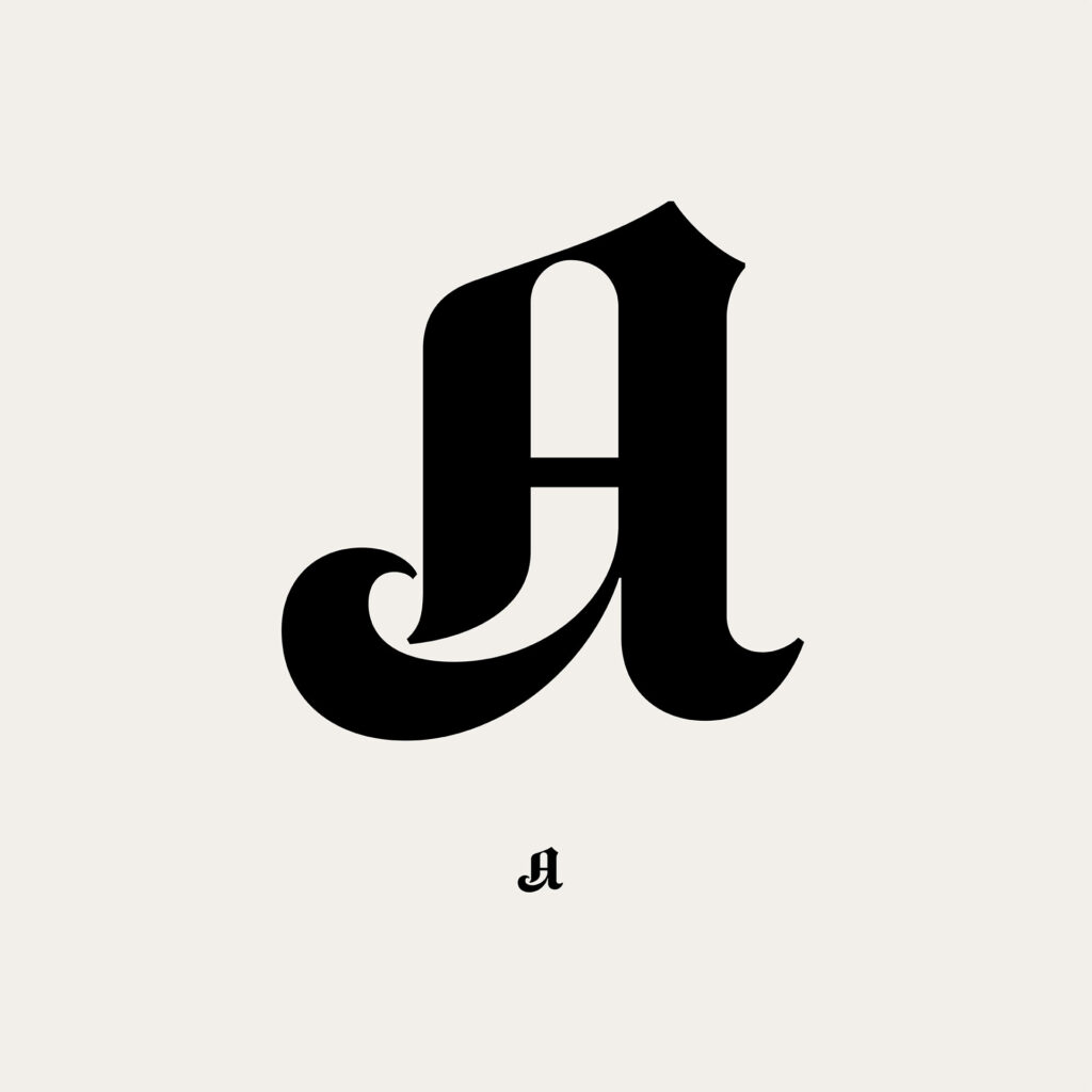
The initial Aftenposten ’A’ is a very strong linguistic and pictorial abbreviation. The ‘A’ has been an appreciated part of Aftenpostens visual identity since the first Sunday magazine supplement, carrying the abbreviation, was first published in the thirties.
It is incredible important today, that the readers are able to identify the product clearly, wherever they are, reading mobile device, watching a video, hearing a podcast …


