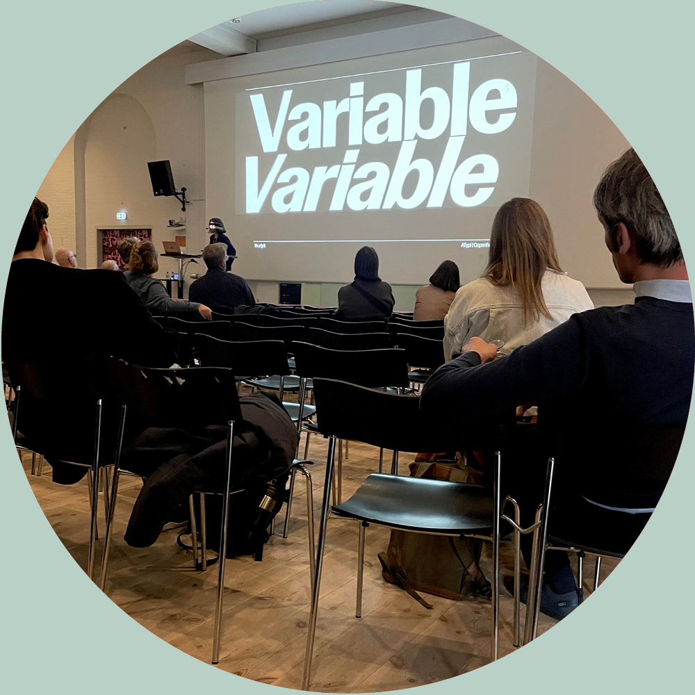
I gave a talk at Atypi Copenhagen in April; “The Refresh of the News Brand Icon Aftonbladet”, where I highlighted why a variable font also can be a great method for developing a logo.
ATypI Copenhagen brought together the global type community for five unforgettable days of talks, workshops, and conversations in one of Europe’s most beautiful cities.
With over 100 sessions exploring typography, this year’s conference was a vibrant reflection of the evolving landscape of typography.
The logo and logo typeface is directed by Anna Thurfjell Studio and designed together with Christian Schwartz and Greg Gazdowicz, Commercial Type.
For experiment Schwartz and Greg Gazdowicz, suggested to build a variable font which became an important part of our method and together we explored the typographic axes and design space.
- Width
- Contrast
- Squareness
Christian Schwartz has written a thorough case study on the typeface design for the logo and logo typeface for Aftonbladet.
Aftonbladet’s new logo is developed and designed with a holistic approach for a coherent logo for all products, across all touch points, sub brands and communication.
The video of the talk can be viewed at ATypI organisations site. Read also the full story on the: Brand refresh for Swedens largest news media Aftonbladet
Visual shows talk at ATypI, photo: Irene Thisner. The typeface in use is Control, Commercial Type, a typeface that made me curious on variable fonts.

