TNR to type-wash our times?
Type is Politics and Times New Roman is Rubios new pick for the US governing documents based on the facts that TNR looks more serious and less woke than the previous sans serif font Calibri.
The pioneering typeface TNR by Stanley Morrison for the London Times 1931 was the first typeface of it’s kind in Europe for a newspaper and is a typeface worthy it’s respect for its balanced and strong serif form. I like Times too. News and news design always driven typography development and change throughout history.
Type is music
If a typeface is woke or not is certainly not something any government controls. Type has its own way of moving. Type is like music where something suddenly feels right again so even though old TNR feels too common these days it may get its revival too.
Old TNR is really not the choice for our times, despite TNR is supplied in almost every computer on earth, it is to week on the screen. It was drawn for the 1930ties.
Type needs to be prepared for the future, how we read news on mobile first today and for motion, video and SoMe. To become woke or whatever you wish type has to work for the streaming era.
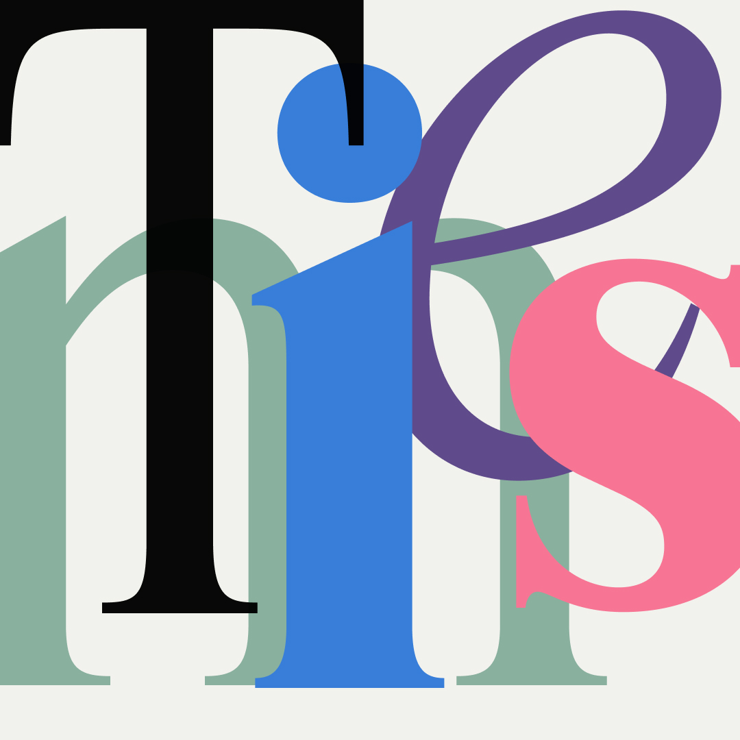
3 typefaces inspired by the old Times:
- Tiempo: A modern classic of TNR and a real working horse by Klim Type, NZ.
- Items: Full variable TNR from Finland! By the duo Schick-Toikka, FI/ DE.
- Feature: This ”Americano Times” is a magazine type for the NYT: T style magazine by Commercial Type, US/UK.