New site design with type in; Control
The new site design is designed with the typeface Control, Commercial Type, 2024.
It’s a typeface that made me curious.
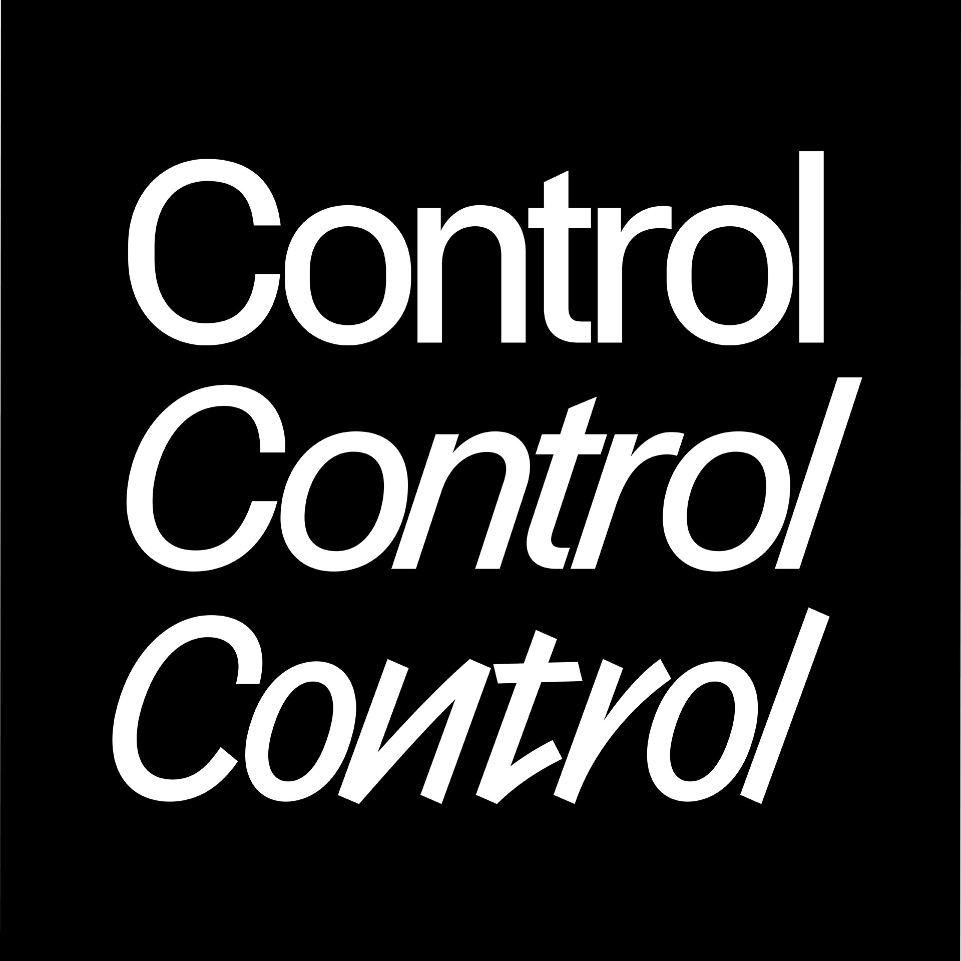
Control was designed in and for the medium of variable fonts. Control has no “correct” version.
Christian Schwartz conceived of the family as a spirited homage to Walter Käch’s 1949 lettering manual Schriften Lettering Écriture, a non-prescriptive guide full of example alphabets that included a set of sans serif forms Käch called “block letters.”
Drawn in and for the medium of variable fonts, Control encourages designers to play with axes for weight, contrast, aperture, and tracking, and to choose between an oblique and a cursive as a companion style.
The typeface can express itself as a tastefully legible mid-century grotesk, or it can morph into a tightly spaced headline face straight out of the 1970s.
Miguel Reyes loosely based the zany, frenetic cursive on Van Dijk, published by Letraset in 1982.
The typeface title is a hommage to Janet Jackson and her LP Control, 1986.