It’s nice that, Erja Yläjärvi, Editor-in-chief at Helsingin Sanomat, asked me to conduct a design audit focusing on how the news product hs.fi performs on mobile and the brand experience on every touchpoint.
Helsingin Sanomat (HS) is Finland largest subscribed quality news brand and its also the largest quality in the nordic countries.
The reach is close to 14 M every week in digital. HS is a significant factor in the Finnish society and the public opinion and its also a design icon.
A design audit is an asset that keeps the brand on track and ensures that it’s consistent at all times.
A design audit helps an organisation to see and eliminate UX traps, strengthen your brand and gain a deeper understanding of it.
Finland is one of the world’s most connected countries (96%) and given their history with the innovation of Nokia; being a mobile first innovation country the expectations from readers are very high.
– Anna Thurfjell’s insights on our product made us realise the uniqueness of our brand which we ourselves have forgotten in the pace of everyday work.
It helped us focus on the things we should concentrate on, in both design and usability.
Say’s Emma-Leena Ovaskainen, Managing editor for visuals and design, HS.
Heritage, trust and type
One of the key findings is the heritage brand with the iconic Helsingin Sanomat logo and title-piece dated 1905.
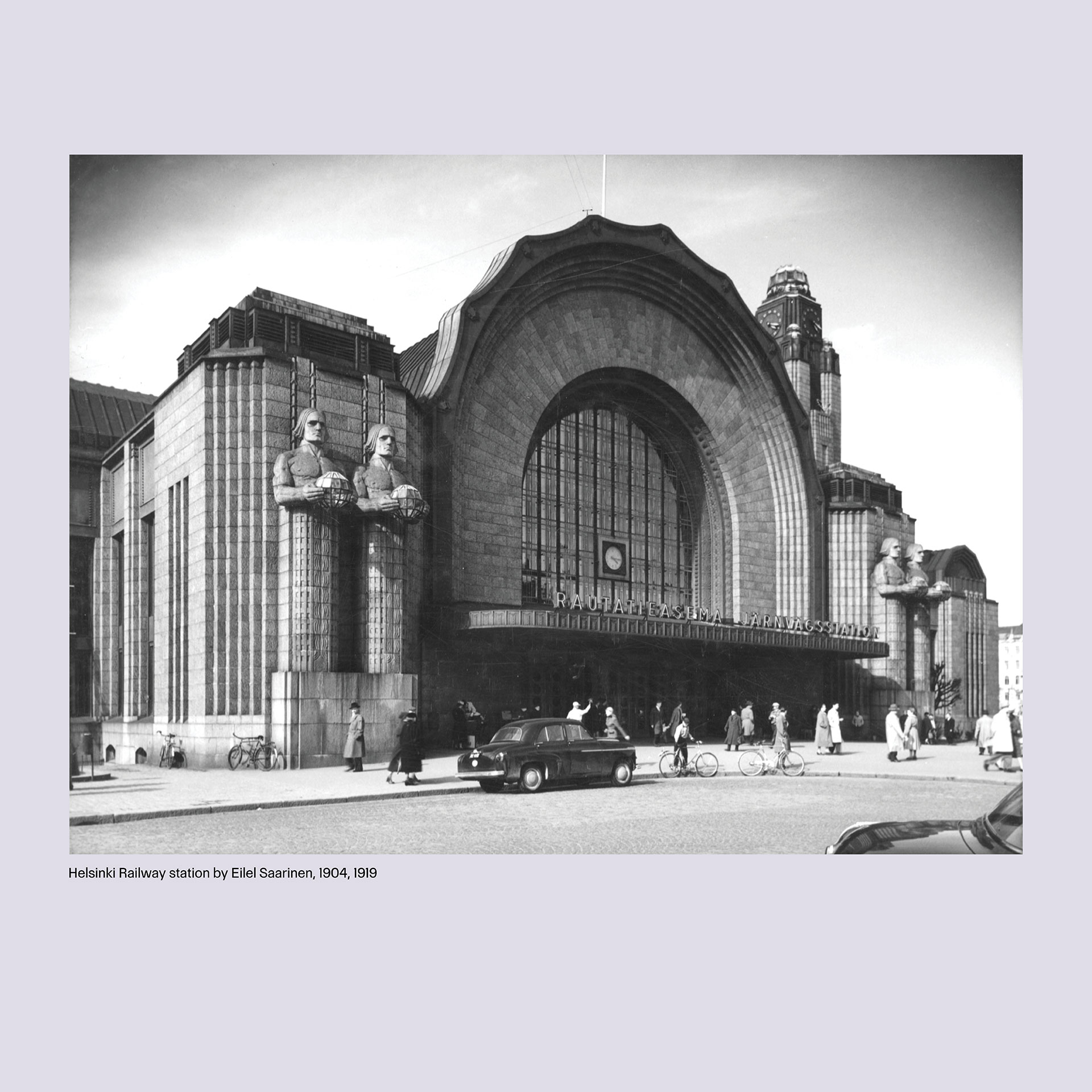
It’s a Finnish Art Nouveau style just like one of the most famous Finnish architecture and buildings: the Finnish railway station by Eilel Saarinen, 1904-1919.
HS is a quality news brand with integrity and trust which has been maintained through its history.
Another key asset in HS design is the customised typeface Sanomat, a typeface family designed 2013 by Commercial Type with a leading serif and sans typeface family named Helsingin and Sanomat, including slab serif and stencil styles. (Today the sans serif is also named Sanomat).
It is stated in the design audit report;
Sanomat is a very distinct and recognisable serif and sans typeface that strengthens your identity
HS strengths in typography are remarkable with both the iconic heritage brand and the quality of the custom typeface.
A design audit also points on conflicts and what can be fixed but the main job is to find what build this brands recognition to confirm it and by doing so strengthen the focus in the brand assets in HS continuous innovations.
– The strengths that Anna found made us very proud, but also, at the same time the weak spots that she pointed out, made us a bit ashamed. – Our customers deserve better! Say’s the Managing editor for visuals and design; Emma-Leena Ovaskainen and continues:
– Since the audit we have kept the documents with us in every development meeting, strategic work and vision building. They give us a tool to lean on to.
– The look and feel of the future Helsingin Sanomat derives from Anna’s thorough audit. And working with Anna and her sharing all the knowledge of design with us was totally professional, accurate and fun, says Ovaskainen.
Kiitos! – Thank you Helsingin Sanomat for a very challenging and exciting study.