
I’m proud to share the studios work with a digital redesign of Helsingin Sanomat, Helsinki, is launching, in a series of launches this spring. First out is the body text.
HS published a story, on the news site; hs.fi today, where Paul Barnes and I’m interviewed. I’ve translated it for you.
View the new design on the studios site or YouTube channel.
Helsingin Sanomat has changed the text type of its articles
The redesign, to be implemented in the spring, aims to improve the readability of online articles, differentiate article types, and clarify the structure.
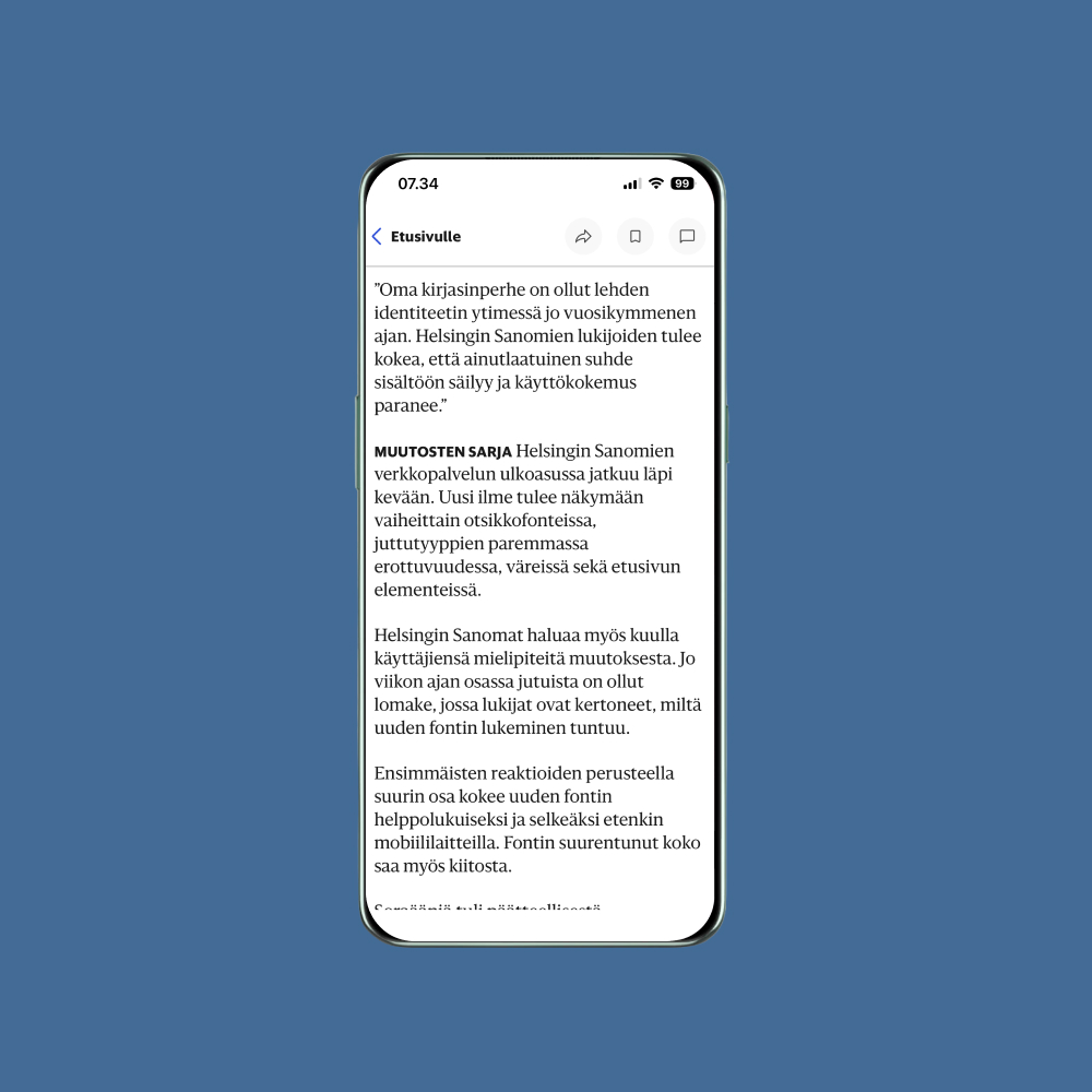
HELSINGIN SANOMAT articles now use the new Sanomat News font.
The change aims to achieve a uniform typographic look for the entire news service. The text will be larger and readability will be improved, especially on mobile devices.
THE NEW TYPEFACE was designed by Paul Barnes, who created the Sanomat font family for Helsingin Sanomat’s tabloid reform in 2013 together with Christian Schwartz.
Barnes and Schwartz’s Commercial Type studio is one of the most well-known in its field. Their work includes fonts for British newspapers The Guardian and The Daily Telegraph, among others.
Paul Barnes says that the design of the new font faced familiar challenges with the Finnish language. The Sanomat font responds to exceptionally long words and repeated letterforms with its soft endings.
“In the headline version, the endings are short and muted. The text version responds to the need for a font that works well at small sizes and on screens. Sanomat is intentionally not very sharp, but has an organic warmth. These give the typeface a friendly sound.”
The comparison image shows the most important difference between the old and new fonts: the new Sanomat News is larger and lighter than the Publico previously used for the body text (view the comparison in HS article). The article has a more airy appearance and readability is improved.
BARNES IS proud to have been involved in creating a typeface that has become such a strong part of Helsingin Sanomat’s look.
“Fonts and typography are central to people recognizing the newspaper and the brand. When HS ran a campaign on freedom of expression, a large part of it was based on fonts. The characteristics of the printed newspaper’s identity have clearly been transferred to the digital environment as well.”
The new font’s properties can be adjusted continuously, so that it adapts better to the digital environment than the previous Publico font.
The design overhaul also includes a technical improvement, as HS introduces variable fonts.
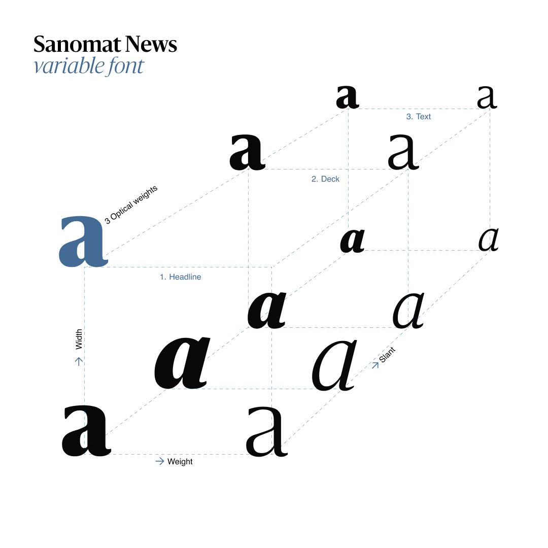
“Variable fonts allow you to adjust the details of the font steplessly so that it looks perfect at any size. It doesn’t have too much contrast in the text and it’s not too loose and clumsy in headlines.”
The new font is also optimized for dark reading mode, which is becoming increasingly popular on mobile devices.
THE IDEA to renew the text style came at the end of 2023, when Swedish designer Anna Thurfjell reviewed Helsingin Sanomat’s design and branding and made suggestions on how to renew them.
One of the most important findings was that the appearance of the articles had deteriorated over the years and that the body text designed for print was not optimal for digital stories.
The changes to be implemented this spring were made by Thurfjell together with Sanomat’s development team and Helsingin Sanomat AD’s Tuomas Jääskeläinen. The focus of the design was to ensure readability and better differentiation of article types.
The redesign is a continuation of HS’s previous design thinking. The variable font Sanomat-News carries the newspaper’s heritage, while the Helsingin News font creates a more modern look.
Typefaces with different styles and weights are needed to build both the content and the HS identity.

“High-quality articles are the core of the HS brand. Letters are not just a tool for content, they define how journalism feels,” says Thurfjell.
“HS own custom typeface family has been the core of the newspaper’s identity for a decade. Helsingin Sanomat readers should feel that the unique relationship with the content is maintained and the user experience is improved.”
A SERIES OF CHANGES to the appearance of Helsingin Sanomat’s online service will continue throughout the spring. The new look will be visible gradually in headline fonts, better separation of article types, colors and elements on the front page. Helsingin Sanomat also wants to hear its users’ opinions on the change.
For the past week, some of the articles have included a form where readers have told us how they like reading the new font. Based on initial reactions, most people find the new font easy to read and clear, especially on mobile devices. The increased font size is also praised.