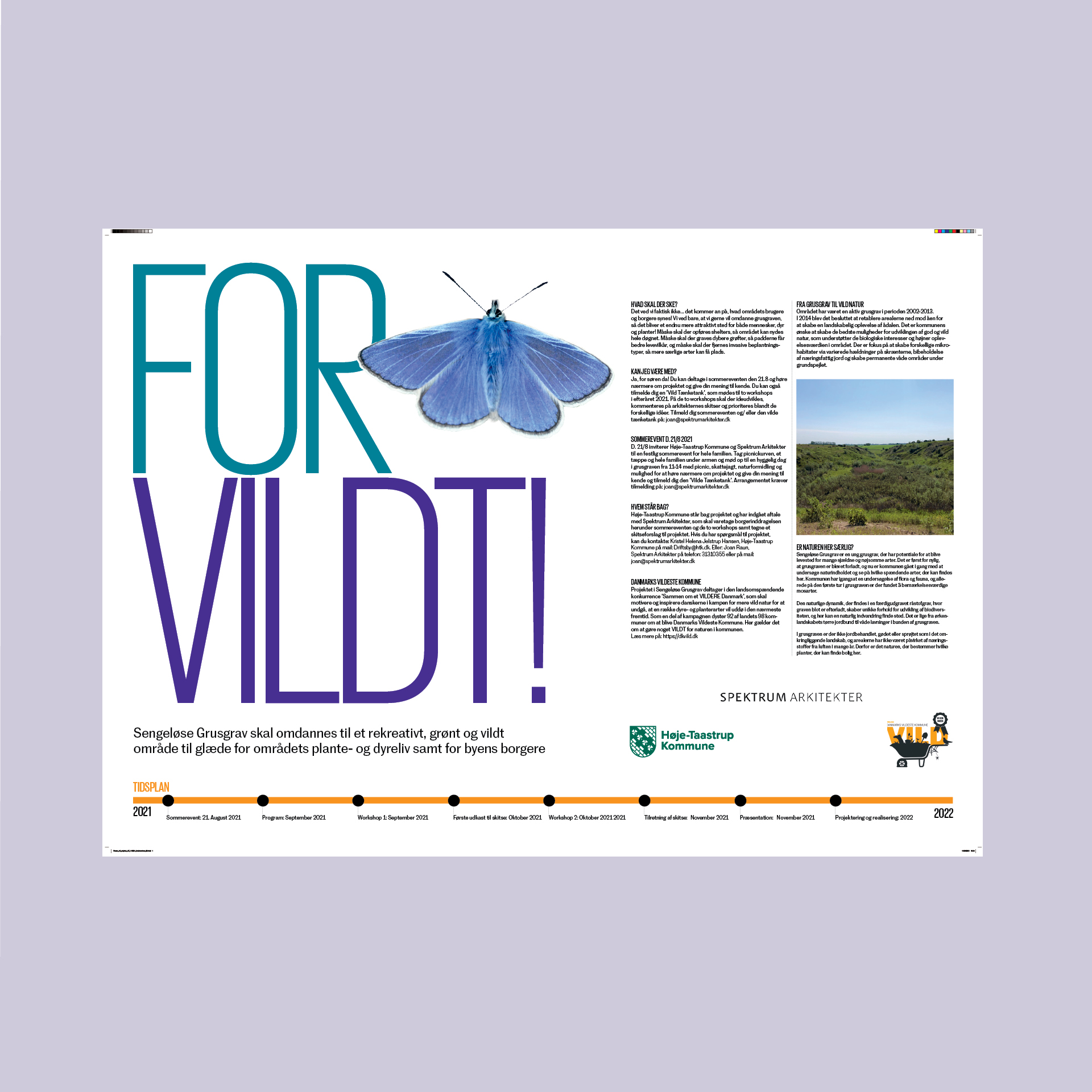
A butterfly is the sign of summer and rebirth
A few years ago I used the blue butterfly (Polyommatus icarus) to communicate: a recreational green and wild area in Denmark, in a sign design for the landscape architects; Spektrum Architects.
The butterfly is a fascinating creature with the metamorphosis which tells us something important on nature. The blue butterfly is under treat in Denmark.
The butterfly is a recurring symbol in my design and it symbolise rebirth. To solve design today is not just about new ideas, produce and build new things … it is how we reuse and redesign with care for our global space on earth.
I wish to see a blue butterfly again. In the Nordic countries we say if the first butterfly you see in the start of summer is yellow it means luck and you’ll get a sunny summer!

