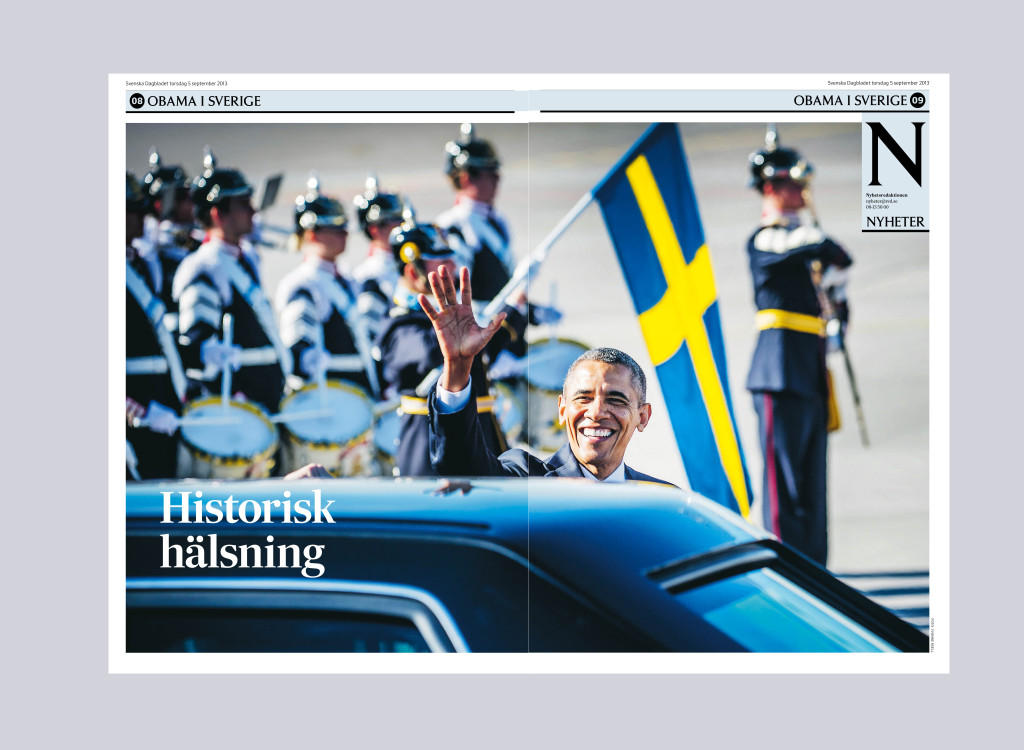
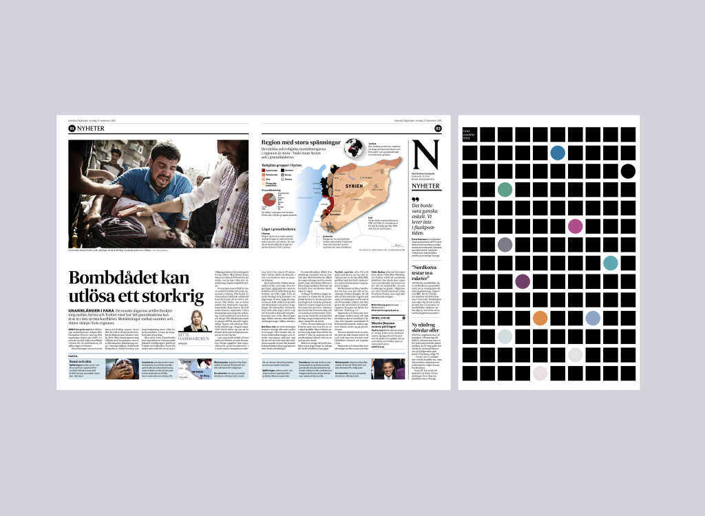
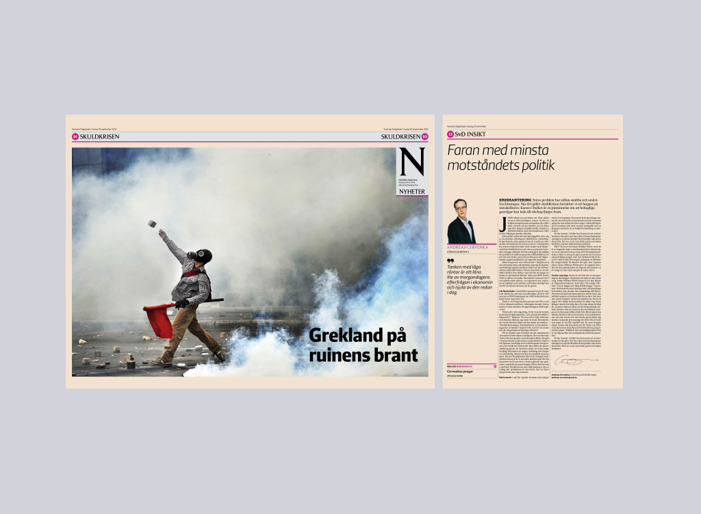
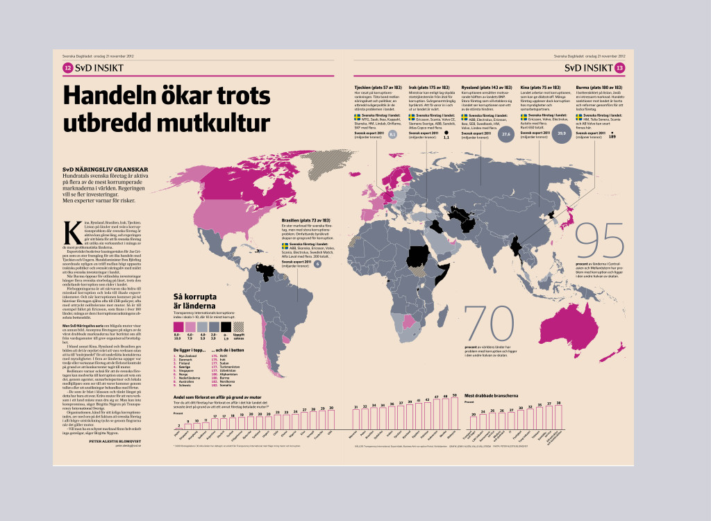
2003 — 2013 Svenska Dagbladet is a strong brand in several products. The New SvD is a modern newspaper with an emphasis on in-depth journalism, great stories, photography, info graphics, illustration, layout and presentation. One challenge was to find a new structure and the inspiration for this work became New York City’s urban planning, the city’s so called grid. The main inspiration for the whole redesign, the engine, was the work to direct a new customized typeface called Sueca, designed by Mário Feliciano. The aim with the type was to combine the best of the contemporary in the custom Sueca typeface, 2009 and the beautiful alphabet design called Forsberg, also an exclusive design for Svenska Dagbladet, 1960.
I have developed and maintained the visual identity, look and feel, with the use of the same type identity for all SvD products, sections heads and magazines titles across platform.
I directed several redesign on web, mobile and tablet between 2010-2013. The customized typeface Sueca gives the digital readers a better scan and reading experience and I was a pioneer by bringing the font into the website already in 2011. Today the customized typeface Sueca is used across all platforms. The colour system is safe colour keys in both print and digital channels. By bringing together the channels in a clearer visual way it will be easier for the reader to connect.
Read about my work with SvD’s customised typeface Sueca
Read about my work with SvD’s title-piece and logo.